Mostly Mapping Map of the Day - July 31, 2017
- Subscribe to RSS Feed
- Mark as New
- Mark as Read
- Bookmark
- Subscribe
- Printer Friendly Page
- Report Inappropriate Content
This morning over breakfast I was browsing the news on my tablet and found this article on climate change on the CNN site.

The articles links to a study by the Union of Concerned Scientists, released last Wednesday, listing the cities that will be inundated by sea level rise and citing other climate related issues affecting coastal communities. The study includes a link to When Rising Seas Hit Home: An Analysis by the Union of Concerned Scientists—a Story Map, and also our Map of the Day today.
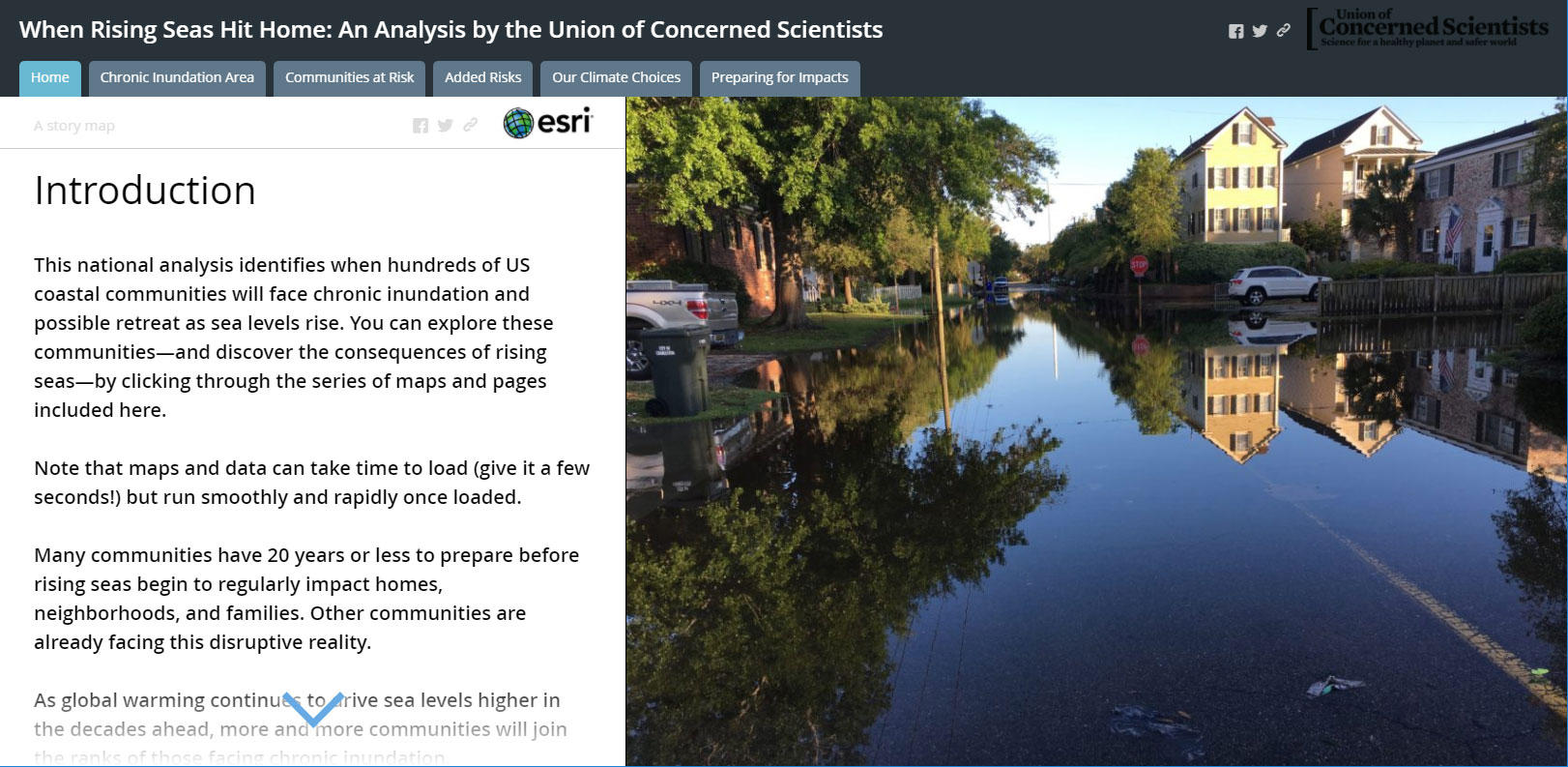
The app presents the results of GIS analysis as a series of live maps, bound together in an interesting way and all contained within a Story Map Series. The Map Series uses the tabbed layout, one of three options you can choose from (others options are the bulleted and side accordion layout). Each of the Map Series tabs includes a Story Map Journal to help tell the story. The viewer works across the tabs from left to right, with each tab revealing a Map Journal that is viewed from top to bottom. This pattern of combining Map Journal within a tabbed Map Series is especially effecting.
What I like about this map
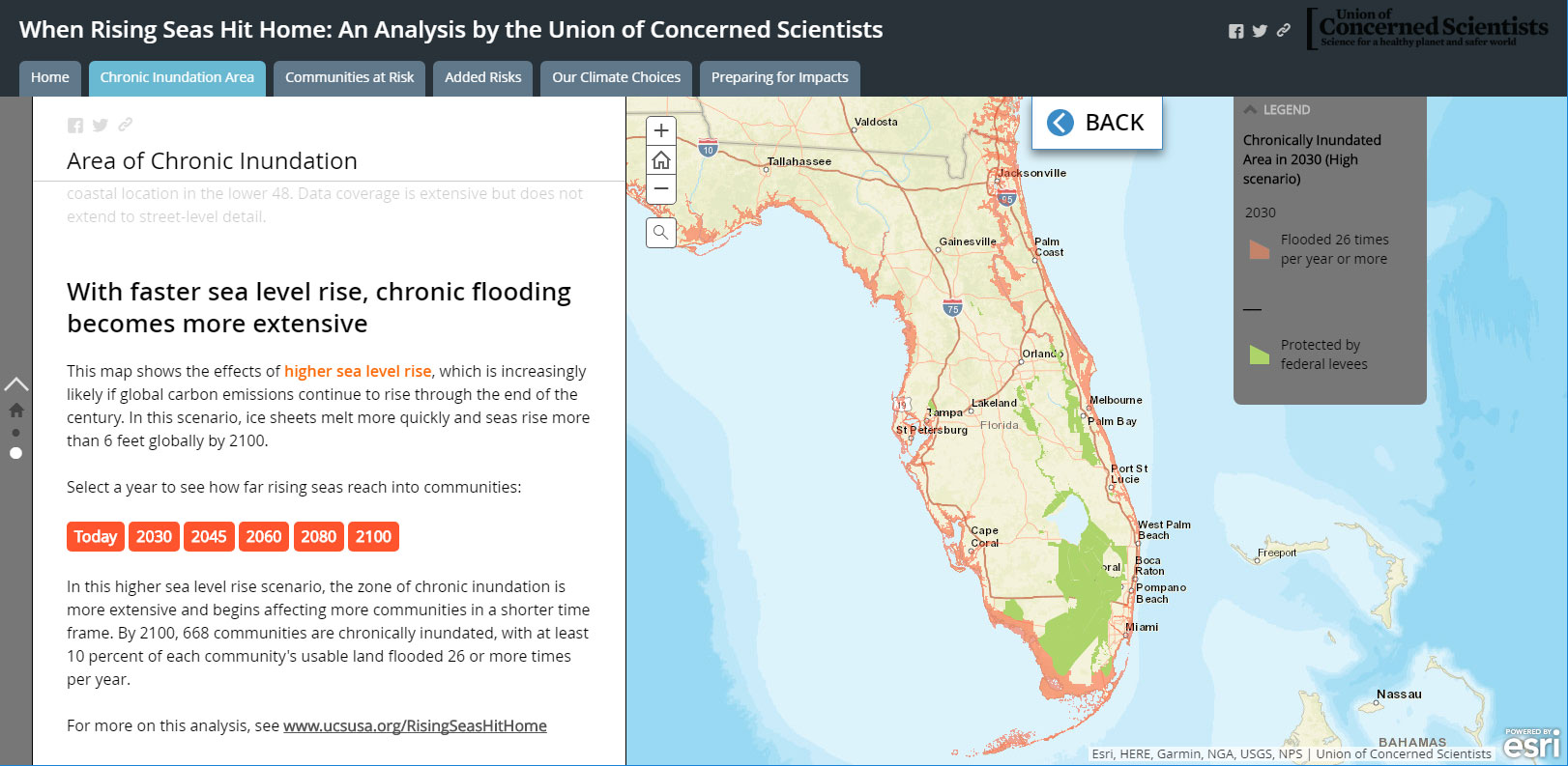
There's lots that I like about this well-crafted story. It has an introductory section as well as a conclusion. It uses a compelling title to help lure the viewer into the story. And the legends, driven directly from the web map, use layer names and are presented in a way that helps the viewer make sense of what they see.
It also takes advantage of color and Main Stage actions in the Map Journal side panel to reveal the story, and allow the viewer an opportunity to explore. For example, in the Chronic Inundation Area tab, the third section in the Map Journal uses text color and button color to link the side panel to what you see on the map. Main Stage actions are behind the buttons, changing the content on the Main Stage to show rising sea level over time.
All of this makes this a solid Story Map Series, and a great example of how you can use story maps to deliver reports.
Climate Resilience Environment and Natural Resources Story Maps Sciences
You must be a registered user to add a comment. If you've already registered, sign in. Otherwise, register and sign in.