- Home
- :
- All Communities
- :
- Industries
- :
- Education
- :
- Education Blog
- :
- Enriching Instruction with 3D Mapping
Enriching Instruction with 3D Mapping
- Subscribe to RSS Feed
- Mark as New
- Mark as Read
- Bookmark
- Subscribe
- Printer Friendly Page
- Report Inappropriate Content
One of the most commonly used themes in GIS instruction over the past 20 years is the mapping and analysis of earthquake data. There are many good reasons why many of us teach with earthquake data, including that one can easily obtain real time feeds from the USGS in addition to historical data, the fact that spatial patterns as well as those of magnitude and depth are fascinating to examine, and that the teaching of natural hazards touches on so many other pertinent themes and subject areas, including settlement, proximity to oceans, land use, slope, history, Earth Science, geography, and mathematics, and that GIS and spatial thinking skills can be fostered.
Core to what many of us in the GIS education community hold dear is the message that "just because a tool exists, that alone is no reason to use it." That message applies to the 3D Scene Viewer. Yes, you and your students could make 3D maps of many of the variables you map and the themes you teach--whether it is natural hazards (earthquakes, as I have done for this essay, or tornadoes, hurricanes, wildfires, hailstorms, and others), population change (with population characteristics or changes in neighborhoods, counties, states, or countries shown as extruded polygons), field data (as in the 3D scenes I made recently of student weather balloon launches or paragliding), or many other types of data. But only do it if it enhances your instruction and better enables you to meet your goals, whether those goals are content, theory, or skills. In the case of earthquake analysis, mapping the data in 3D adds value, and therefore, I do it. I do similar work from time to time in examining population change, with extruding polygons showing growth or decline, and in other activities. I don't use 3D in every lesson, but when I have done so in professional development sessions with faculty or teaching university or primary or secondary students, I have noted a greatly increased level of engagement in the content, an increased number of relevant questions being asked, and focused investigations. Our world is a 3D world, and there is no reason to confine yourself to 2D maps when these tools are at your fingertips and viewable on any device.
Below is a static view of my 3D scene for 30 days of earthquakes, or you can interact with it here. How did I create this? First, in ArcGIS Online, in "My Content", I added the USGS real-time earthquake feed CSV file showing all earthquakes over the past 30 days with a magnitude of 2.5 and above. I created a feature service from this CSV file. I then started a new 3D Scene and added my new feature service to it. I then changed the style to map the variable "Mag" for magnitude, selected the thin cylinder, adjusted the size to be a range in meters from 75000 to 600000 on the ground (600 km "high" for the most severe earthquakes), used "absolute height" for the elevation mode, and turned the pop-ups, legend, and labels on (using "Mag" as the label field). It should be noted that my feature service is no longer "the last 30 days" but static as of the time I created it (May-June 2017), but you can do this monthly and thereby analyze the pattern over time.
Use my interactive 3D scene for earthquakes in your own instruction. You don't even have to log in to do some powerful things, such as examining aftershocks, turning on the shadow and changing the date and time for a quick lesson about seasonal change, or to navigate to specific areas around the world to analyze the number and the magnitudes of earthquakes. Be sure to investigate those earthquakes shown "on the horizon" in the image below--what is the name of that island chain to the northwest, and why do so many earthquakes occur there? If you do log in, you have even more power at your fingertips. For example, you can add data to the scene, such as plate boundaries, volcanoes, fault lines, or world cities. This will allow you to extend the inquiry to investigate the proximity of earthquakes to different types of plate boundaries (subduction zones versus mid-oceanic spreading ridges, for example), to specific types of volcanoes, to fault lines, to surficial geology, and to major population centers--which cities are most at risk? Then, you can save the 3D scene with your added layers to your own ArcGIS Online account and re-use it in the future. See my video of this essay here. To dig still deeper into the world of 3D, try Esri's CityEngine.
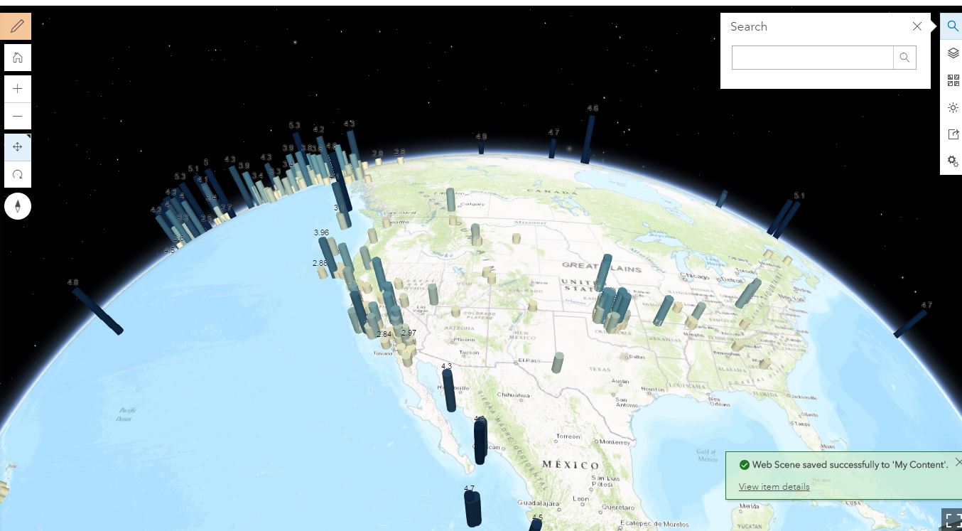
One month of earthquakes mapped by magnitude using the 3D Scene Viewer in ArcGIS Online.
How are you using 3D scenes in your instruction?
You must be a registered user to add a comment. If you've already registered, sign in. Otherwise, register and sign in.
-
Administration
38 -
Announcements
45 -
Career & Tech Ed
1 -
Curriculum-Learning Resources
179 -
Education Facilities
24 -
Events
47 -
GeoInquiries
1 -
Higher Education
519 -
Informal Education
266 -
Licensing Best Practices
46 -
National Geographic MapMaker
17 -
Pedagogy and Education Theory
187 -
Schools (K - 12)
282 -
Schools (K-12)
185 -
Spatial data
24 -
STEM
3 -
Students - Higher Education
231 -
Students - K-12 Schools
86 -
Success Stories
22 -
TeacherDesk
1 -
Tech Tips
83
- « Previous
- Next »