- Home
- :
- All Communities
- :
- Products
- :
- ArcGIS Pro
- :
- ArcGIS Pro Questions
- :
- Re: Poor text halo quality in ArcGIS Pro PDF outpu...
- Subscribe to RSS Feed
- Mark Topic as New
- Mark Topic as Read
- Float this Topic for Current User
- Bookmark
- Subscribe
- Mute
- Printer Friendly Page
Poor text halo quality in ArcGIS Pro PDF output
- Mark as New
- Bookmark
- Subscribe
- Mute
- Subscribe to RSS Feed
- Permalink
- Report Inappropriate Content
Hi all,
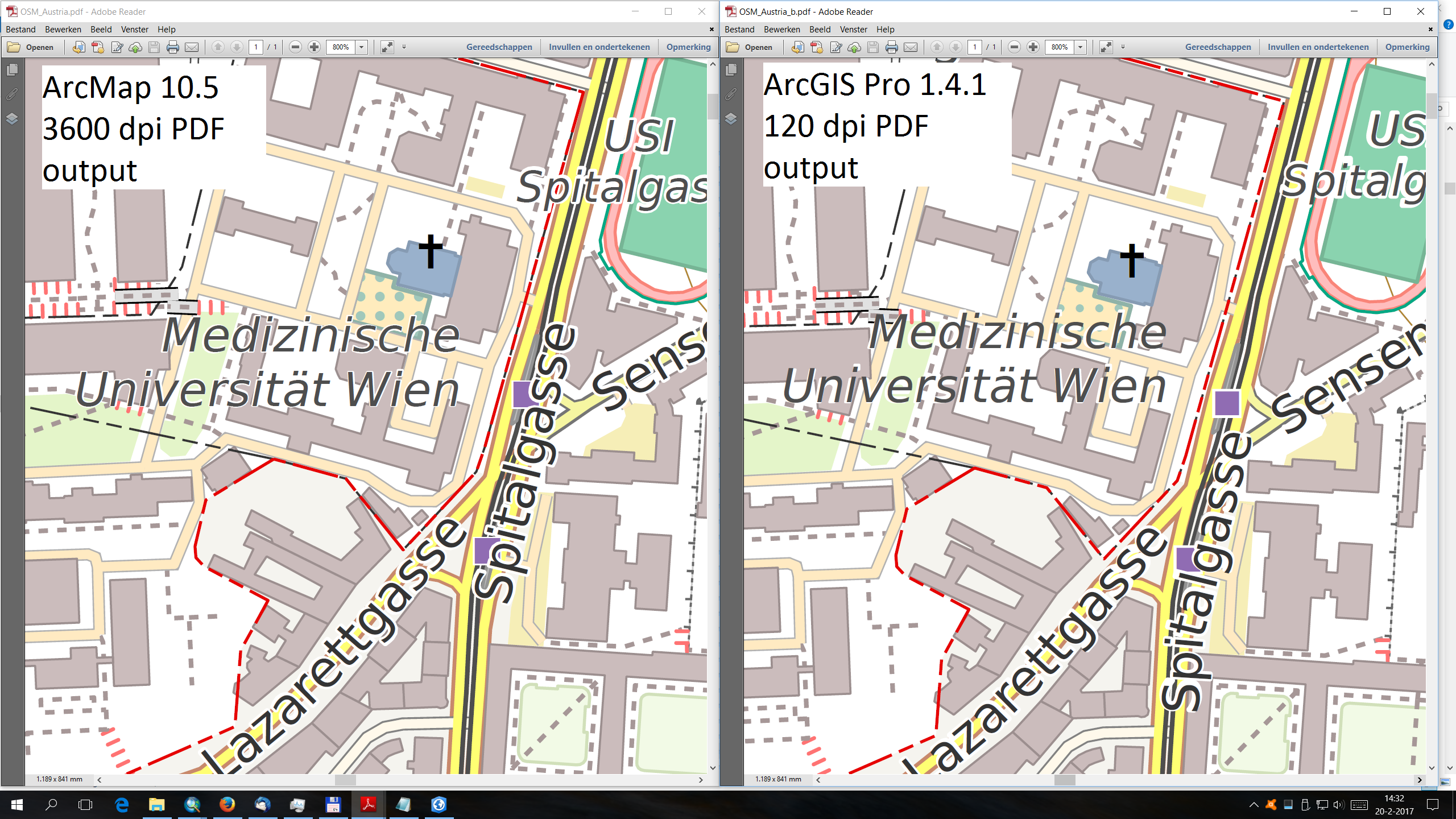
Anyone else noticed this? When I export a layout to PDF from ArcGIS Pro (1.4.1) at the default 120 dpi resolution, any text label halos are very poorly rendered in the final PDF output.
Now I was well familiar with this issue in ArcMap due to its different display pipeline, where low dpi (< 300 dpi) settings would not only lead to poor text label halo quality, but also loss of fine detail in the PDF output, and often even thin line objects not being exported at all and thus disappearing in the output.
I therefor always use some very high dpi setting in 100% vector maps (e.g. 3600 dpi) in ArcMap, so as to force proper rendering and higher quality text label halos output, and at least a minimum 450 dpi for combined vector and raster output.
However, due to its new architecture, Pro was supposed to solve these issues as far as I understood. Indeed, when looking at the true GIS vector data, the quality of the PDF output even at a low 100 dpi or so, is excellent.
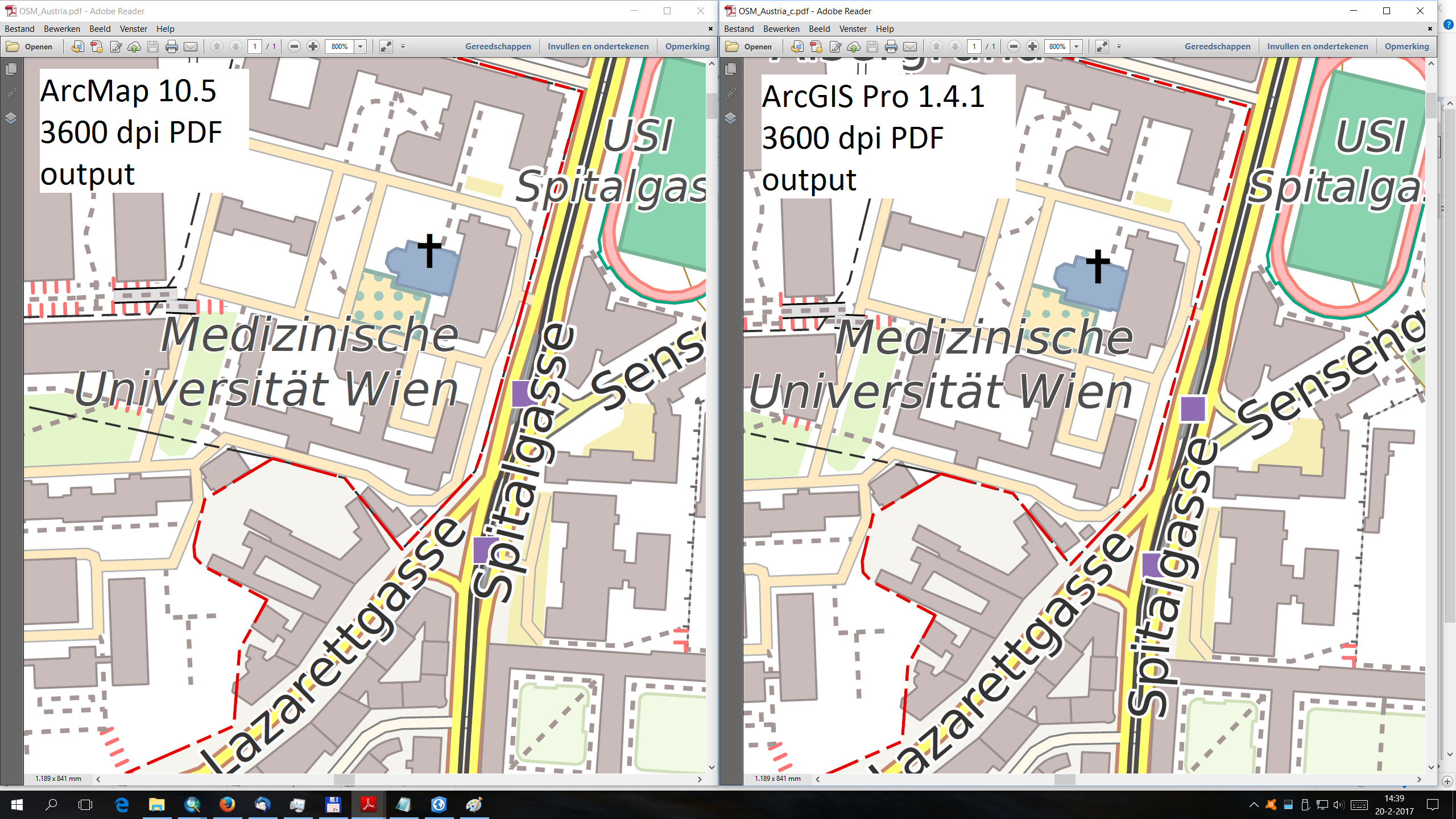
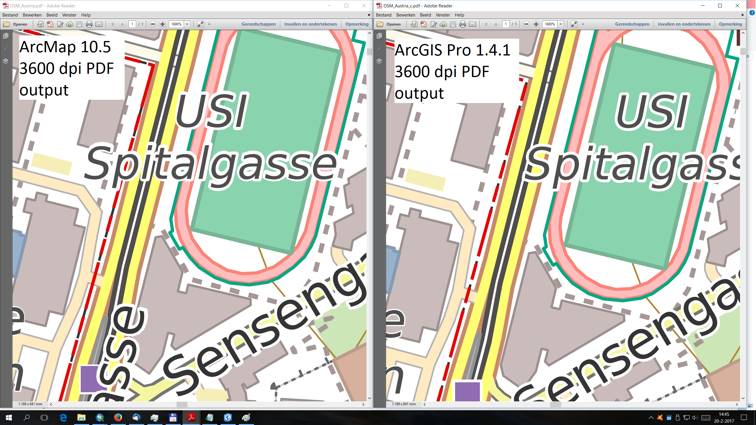
Unfortunately, not for the text label halos though!... Look at the accompanying images (note: 800 or 1600% enlargement), which shows both a high res ArcMap output, and Pro output at different resolutions. Notice how at 120 dpi, the halos are rendered really poorly. Instead of nicely encircling the corresponding label characters, the halos appear skewed, shifted and e.g. the "i" dot is square instead of trapezium as it should be for the italic text.
Notice that with a 3600 dpi setting in Pro, the issues are completely resolved, and in fact, the halo rendering is even better than from ArcMap at the same resolution.
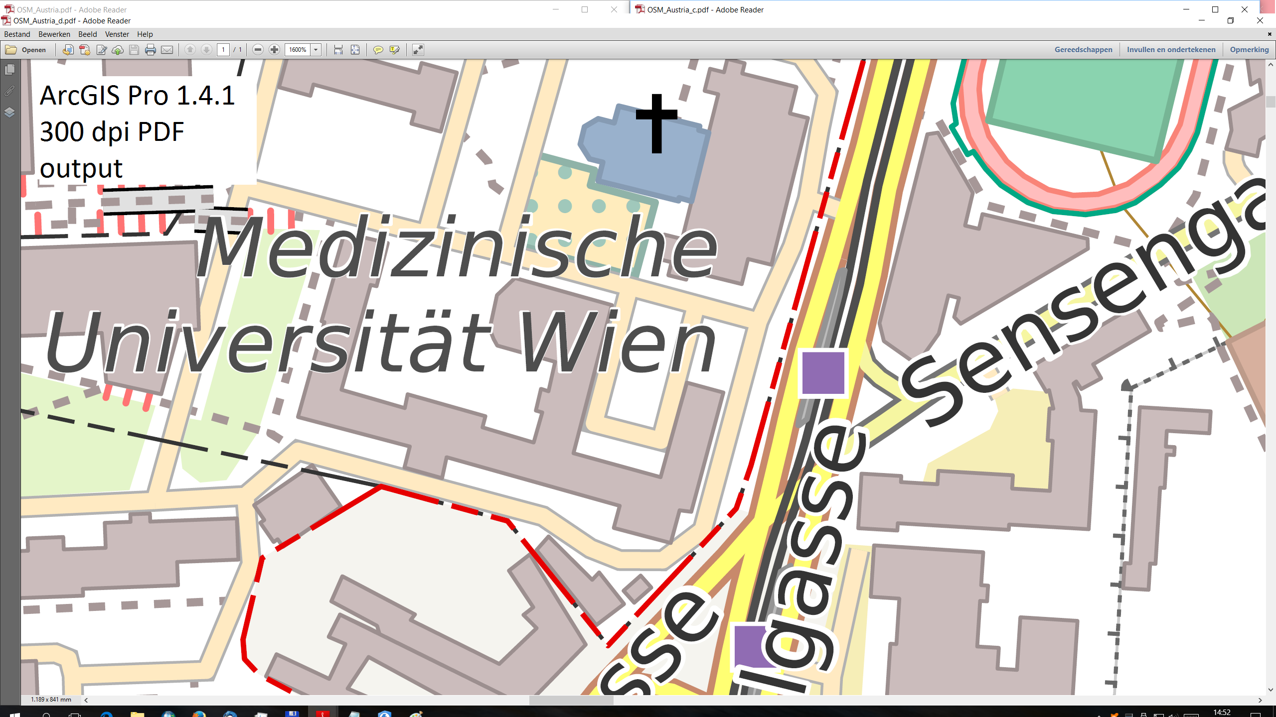
However, a not unrealistically low 300 dpi setting, still leads to big artifacts in the halos... This will be an issue when exporting combined raster + vector data, where you may wish to reduce output size by limiting the dpi setting. As for now, this will lead to poor text halo quality in the PDF output.
Note 1: for the full resolution images, open the attachments of the post instead of clicking on the images.
Note 2: the screenshots are based on Adobe Reader XI 11.0.19, so not the newer "DC".
Marco
- Mark as New
- Bookmark
- Subscribe
- Mute
- Subscribe to RSS Feed
- Permalink
- Report Inappropriate Content
Jeremy,
Thinking about this a bit more, at least as far as it relates to the actual halo results, I think the current quality is entirely expected for the given low dpi's. Of course, with less than 300dpi settings, there is very little possibility to correctly encode or render a tiny graphic / mask halo. This will especially affect the results for small fonts as used here.
On the other hand, one does wonder if it wouldn't be better if the specific "halo" setting, was separated from the ordinary graphics encoding in the PDF, and shouldn't by default use a much higher dpi to correctly render the halos.
The problem with the current approach is that, especially for small font sizes as used in the examples here, the poor halo quality at low dpi also heavily influences the anti-aliasing results on screen, meaning the readability of the small texts are significantly negatively affected.
Marco
- Mark as New
- Bookmark
- Subscribe
- Mute
- Subscribe to RSS Feed
- Permalink
- Report Inappropriate Content
Marco,
Your conclusion is quite correct - this is most likely just due to the inaccuracy in the _positioning_ of the text and halo when outputting at a very low resolution. I've been able to repro here with 5.5 pt text as well. I'll send it to our dev to see if there's anything we can really do to line up the text and halo more accurately.
J
- Mark as New
- Bookmark
- Subscribe
- Mute
- Subscribe to RSS Feed
- Permalink
- Report Inappropriate Content
OK, good to hear you were able to reproduce it.
As I wrote, I guess the only way is if ESRI makes an exception for the halos, and by default outputs them at higher resolution. I have zero knowledge of the PDF format..., and don't even know whether that is possible at all. Might be a file format limitation.
Anyway, for anything critical and 100% vector maps, outputting at high dpi (probably > 600 dpi or so, as 300 dpi still wasn't enough) should be the solution for now.
DejaVu 5.5 pt is small, but not uncommon and certainly not unreadable in printed form, and quite well usable on todays "retina" display devices.
- Mark as New
- Bookmark
- Subscribe
- Mute
- Subscribe to RSS Feed
- Permalink
- Report Inappropriate Content
Our recommendation is always to use the output PDF at resolution/zoom level that's appropriate for the output resolution. To illustrate what I mean: export same map at 120dpi to PNG. You'll find that neither text nor halo have any amount of clarity at that resolution when diminuitively sized. That inaccuracy carries over into the PDF - but PDF lets you zoom in to the tiny text and still make it readable.
The core mechanism that creates the mismatch is that the text and the halo can potentially have different positioning coordinates at a very low resolution, due to grid-fitting to the requested DPI. Using a higher DPI will of course minimize the potential for mismatch.
- Mark as New
- Bookmark
- Subscribe
- Mute
- Subscribe to RSS Feed
- Permalink
- Report Inappropriate Content
Jeremy Wright schreef:
Our recommendation is always to use the output PDF at resolution/zoom level that's appropriate for the output resolution. To illustrate what I mean: export same map at 120dpi to PNG. You'll find that neither text nor halo have any amount of clarity at that resolution when diminuitively sized.
Yes, but that may be at least partly attributable to the poor halo quality, and hence consequently poor anti-aliasing that takes place. Since fonts are embedded in the PDF, and are always accurate and high quality independed of the output resolution (at least for 100% vector maps), the mismatch between halo and font is more stinging.
- Mark as New
- Bookmark
- Subscribe
- Mute
- Subscribe to RSS Feed
- Permalink
- Report Inappropriate Content
Jeremy Wright schreef:
Our recommendation is always to use the output PDF at resolution/zoom level that's appropriate for the output resolution. To illustrate what I mean: export same map at 120dpi to PNG. You'll find that neither text nor halo have any amount of clarity at that resolution when diminuitively sized. That inaccuracy carries over into the PDF - but PDF lets you zoom in to the tiny text and still make it readable.
Side note: my monitor is a 123 ppi resolution monitor (2560 x 1440).
When I export the PDF at high resolution from ArcMap or Pro, the small fonts are perfectly readable in Adobe Reader. With proper halos, the anti-aliasing done by Adobe Reader is not bad and the clarity of the text sufficient. Even 5 pt text is readable on this 123 ppi monitor (although of course this is mainly targeted at true print).
Of course, with retina, things look really cool. Opening the same map on my Samsung Tab S is just mind blowing, everything is so sharp, that you almost start wishing for some softening "anti-aliasing" to kick in...
- « Previous
-
- 1
- 2
- Next »
- « Previous
-
- 1
- 2
- Next »