- Home
- :
- All Communities
- :
- Products
- :
- ArcGIS Spatial Analyst
- :
- ArcGIS Spatial Analyst Questions
- :
- Re: Make time-slider with color symbology for poly...
- Subscribe to RSS Feed
- Mark Topic as New
- Mark Topic as Read
- Float this Topic for Current User
- Bookmark
- Subscribe
- Mute
- Printer Friendly Page
Make time-slider with color symbology for polygons
- Mark as New
- Bookmark
- Subscribe
- Mute
- Subscribe to RSS Feed
- Permalink
- Report Inappropriate Content
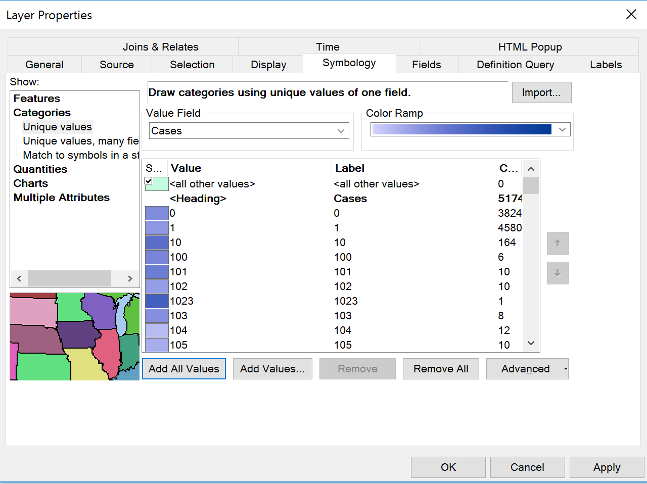
I am working on a thesis where I have data from 2000-2015 that shows lyme disease cases by county for each year. This data has been joined with a county shapefile and I used graded colors based on number of cases/county. I want to use a Time Slider to show the progression each year, and I had to put all the years in one dbf and "transpose" them to get the years in one column (losing the graded colors). Now I have the time slider set up, but I am trying to figure out how to create graded colors again for each county (separated by year) so that the spread can be shown over time using the slider, but I cannot figure out how to do that. I have attached a photo of what the new time slider (aka transposed) attribute table looks like. If you were to scroll down it would continue on showing each county's data. How can I create graded colors from this? (It is already joined with the county shapefile). My second to last picture shows what the graded colors section looked like before I transposed the data and included all 15 years worth of data, instead of just one (in order to use the timeslider). The graded colors section no longer worked when all 15 years were present and transposed. So, instead I had to use the "unique values" option under Categories and use a color ramp, but then what I got is shown in the last picture. I am wondering how to basically get the same results as I did before transposing and when there was only one year's data present, but I want it to show for every year so I can make the time slider.


- Mark as New
- Bookmark
- Subscribe
- Mute
- Subscribe to RSS Feed
- Permalink
- Report Inappropriate Content
Do you have time enabled on your layer? If so the data is probably filtered. Switch it off for a moment to generate the appropriate symbology.
- « Previous
-
- 1
- 2
- Next »
- « Previous
-
- 1
- 2
- Next »