- Home
- :
- All Communities
- :
- Products
- :
- ArcGIS Online
- :
- ArcGIS Online Blog
- :
- Redesigning a City's ArcGIS Online Home Page
Redesigning a City's ArcGIS Online Home Page
- Subscribe to RSS Feed
- Mark as New
- Mark as Read
- Bookmark
- Subscribe
- Printer Friendly Page
- Report Inappropriate Content
If I weren't a GIS professional, I always thought a cool back-up job option would be to name paint colors. Of course, as a GIS professional, I get to play with color here and there - styling a map, designing a web app, etc. So, I knew it would be a fun assignment when, earlier this summer, the City of Boston's GIS team let me and LDafner-esristaff help with a redesign of their ArcGIS Online site, which they call BostonMaps. And even better - the redesign involved working with the City's new web color style, which included wonderfully-named hues like Charles Blue and Freedom Trail Red.
Some background - several years ago, we worked with the City on their initial ArcGIS Online release. They wanted to make a big splash, and were very deliberate about designing their ArcGIS Online presence - creating a banner graphic, customizing the home page, creating new icons, etc. And the result was well-used for several years - but it was time for an update. One thing that spurred the update was that the City was developing a redesigned web site - pilot.boston.gov (now released). It would be a completely different look and feel - the City developed a new brand guideline, complete with new typefaces, logos (and, of course, colors).
Design and branding (especially in digital media) is becoming increasingly important to local governments, and I'm increasingly hearing GIS professionals mention that they want to build maps and apps whose design is harmonious with branding standards. So, we had our marching orders - make the new BostonMaps design harmonious with the pilot.boston.gov site. I wanted to share details of the work we did, in the hopes that it might be useful for others going through a similar process. Here's the approach that we took, in three simple steps:
1. Banner graphic: This is the attention-getter of an ArcGIS Online home page! I've seen many great examples of customers who make their own images using these guidelines. For BostonMaps, we incorporated a map screenshot and added a layer of Optimistic Blue on top. Using the B mark/logo (which we also repeated in thumbnails) and tagging to mark it as an official City website complete the look: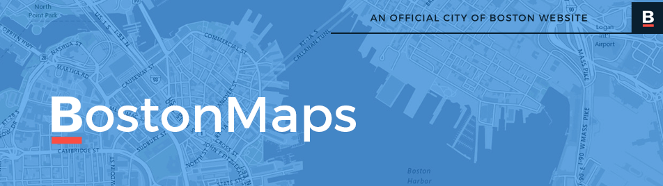
2. Flat Design: You may have noticed that the banner graphic and thumbnails look subtly different than usual - the City's web team requested that we use a flat design and eliminate rounded corners and drop shadows to eliminate the effects that give the page dimension in favor of a more minimalist look (this has been a popular web design trend for some time): 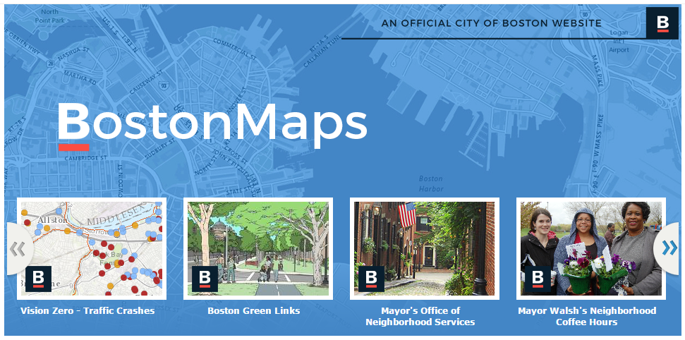 To do this, we went to the Home Page settings and accessed the HTML source code view. Did you know that you can perform various style overrides to the ArcGIS Online home page by inserting HTML/CSS code into this section? For example, this CSS snippet removes the rounded corners & shadows from various home page elements:
<style>
/* remove rounded borders and box-shadow on: */
#matrixLayout, /* org banner */
#featuredMaps, /* featured items control */
#featuredMaps #fHeader, /* featured items control header */
.galleryNode.small .galleryThumbnail, /* individual featured items */
#bottomContent { /* org description */
-webkit-border-radius: 0;
-moz-border-radius: 0;
-o-border-radius: 0;
border-radius: 0;
-webkit-box-shadow: none;
-moz-box-shadow: none;
-o-box-shadow: none;
box-shadow: none;
}
/* if you want to remove the bottom border color on featured items control and org description */
/* this is visible when the box-shadow is removed */
#featuredMaps,
#bottomContent {
border-bottom: none;
}
</style>
3. Icons: Many people use the bottom half of the ArcGIS home page as a container for additional content - perhaps descriptive text, links to popular apps, or contact information. The City wanted to use this area to promote three collections of their GIS work: Story Maps, Open Ddata and Interactive Apps. To mirror the new Boston.gov site, we wanted to use icons for these three categories that matched the same minimal line drawing asthetic. I'm no artist, so I had to rely on icons that were available to use. Enter my new favorite web site - Noun Project. This web site is a great collection of icons that serve as a visual representation of our language - you can find a wide variety of images for anything from airplane to zebra. We found icons by the same artist for consistency, and made sure they were licensed for our intended use. To make them more 'mappy' I added a pushpin symbol in our favorite shade of red. The result:
![]()
Together, these three techniques really had a transformational effect on the City's ArcGIS Online home page - now it blends pretty seamlessly with the City's other web properties, and has a fresh, modern look that the GIS staff is proud to showcase.

Check it out for yourself - you can visit the site here: http://boston.maps.arcgis.com
You must be a registered user to add a comment. If you've already registered, sign in. Otherwise, register and sign in.