- Home
- :
- All Communities
- :
- Products
- :
- ArcGIS Bathymetry
- :
- ArcGIS Bathymetry Questions
- :
- Re: Bathymetry Symbology - ColorHillshadeBAG Proce...
- Subscribe to RSS Feed
- Mark Topic as New
- Mark Topic as Read
- Float this Topic for Current User
- Bookmark
- Subscribe
- Mute
- Printer Friendly Page
Bathymetry Symbology - ColorHillshadeBAG Processing Template color scheme changed (for the worse)
- Mark as New
- Bookmark
- Subscribe
- Mute
- Subscribe to RSS Feed
- Permalink
- Report Inappropriate Content
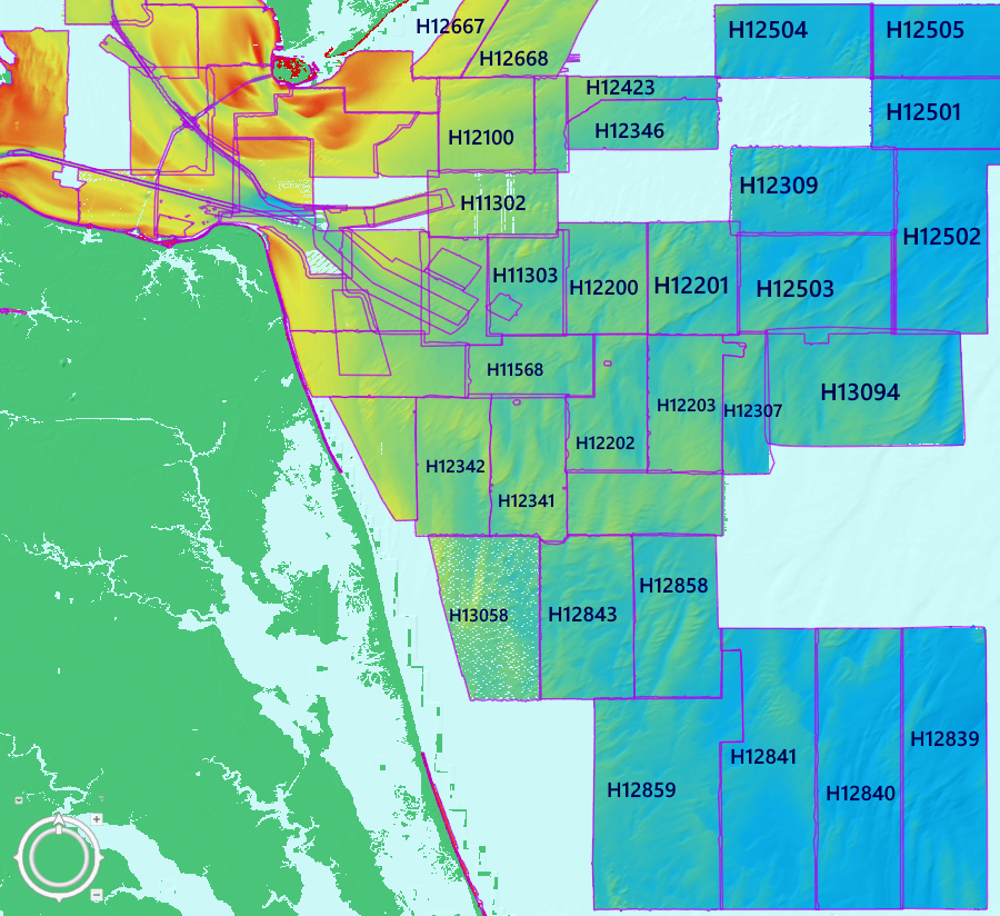
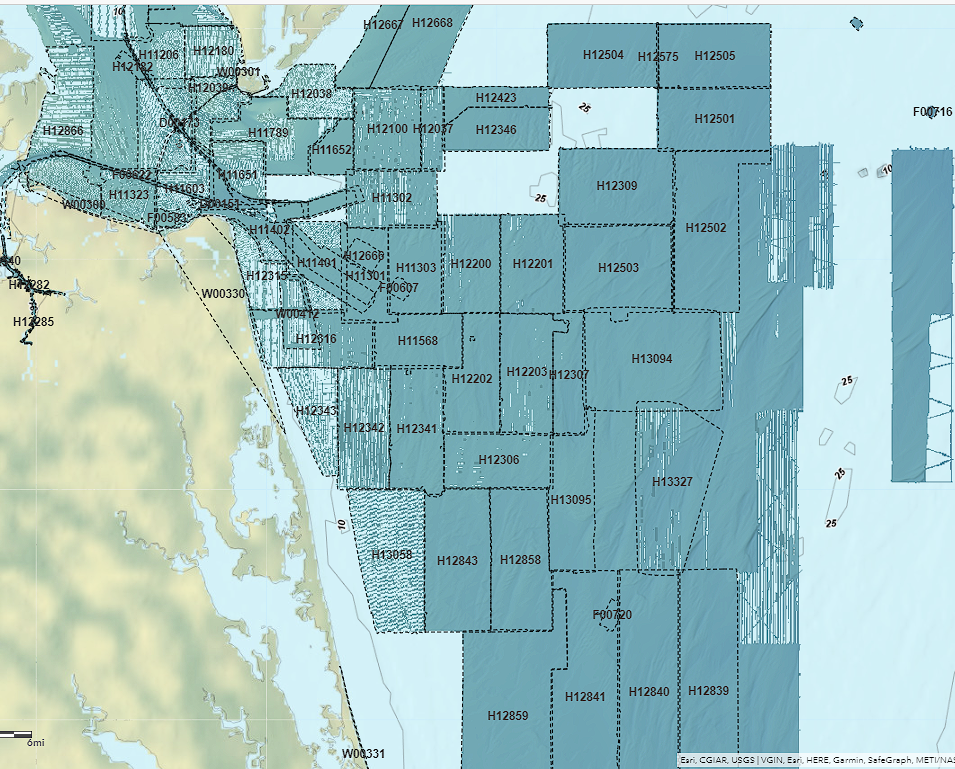
Sometime around the release of ArcGIS Pro 3.0 (maybe earlier), the bag bathymetry hosted imagery changed the way the color schemes are rendered. This seems to be an issues on any platform that display the bag bathymetry image services (ArcGIS Pro, ArcGIS Online, ArcMAP, etc.) It has also changed on the NOAA Bathymetric Data Viewer https://www.ncei.noaa.gov/maps/bathymetry/ .
The ColorHillshadeBAG Processing Template Description reads as follows (which I think has changed too):
"An elevation-tinted shaded relief visualization, using Esri's "multidirectional hillshade". The elevation/depth is displayed using this color ramp: https://www.ncei.noaa.gov/maps/bathymetry/images/bag_color_scale_bukavu.png. This color ramp was adapted from the "bukavu" color ramp from: https://www.fabiocrameri.ch/colourmaps/."
Does anyone know why the color scheme doesn't seem to display as expected. This new scheme is pretty lame (visually). Any thoughts on how to get the old color scheme to display? The Dynamic Range Adjustment (DRA) also seems to be affected. Selecting the DRA option now results in a washed out color scheme that is almost impossible to see the imagery when zoomed in to view the hi-res imagery.
Here's a couple images how the bag bathymetry ColorHillshadeBAG processing template looked like before & after (whatever changes were implemented).
- Mark as New
- Bookmark
- Subscribe
- Mute
- Subscribe to RSS Feed
- Permalink
- Report Inappropriate Content
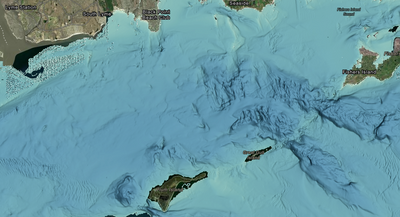
Accessibility issues suggest the need to change from classic 'rainbow' coloring, particularly for color-blindness. The updated colors represent western Long Island Sound, for example, without relying upon the traditional color scheme. NCEI Bathymetric Attributed Grid (BAG) Mosaic - Overview (arcgis.com)
The newer scheme also provides a great bathymetric basemap for display of other content for users' attention.
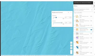
If you want to focus attention on the bathy layer itself, you might look at changing some of the display parameters (screen grab from ArcGIS On Line Map Viewer):
- Mark as New
- Bookmark
- Subscribe
- Mute
- Subscribe to RSS Feed
- Permalink
- Report Inappropriate Content
So how do I get my bathy imagery to display like it used to? I mean, to change a long standing established set of raster processing templates so they're essentially useless for everyone now to accomidate colorblind users seems a bit drastic? How can I add life back into my raster imagery? There's got a be an easy workaround to get the imagery to display a color hillshade, right? And what about DRA, that doesn't work either.
Thanks for the responses.
- Mark as New
- Bookmark
- Subscribe
- Mute
- Subscribe to RSS Feed
- Permalink
- Report Inappropriate Content
Hello,
You may want to provide your preferences to the NCEI organization that provides the RESTful tiled services, but I think they made that change for Section 508 (Accessibility) compliance, which is a legal mandate. For a slightly different bathymetry service, you might use the new BlueTopo from Coast Survey. They are providing it through nowCoast. nowCOAST (noaa.gov)
- Mark as New
- Bookmark
- Subscribe
- Mute
- Subscribe to RSS Feed
- Permalink
- Report Inappropriate Content
Thanks for the reply. I searched all over for some information on the changes to the processing templates but couldn’t find any info. I’m surprised I’m the only one that questioned why the traditional color schemes were retired and replaced with the new pea soup feature suppression color scheme. And thanks for the lead on the BlueTopo option, I’ll check it out.
- Mark as New
- Bookmark
- Subscribe
- Mute
- Subscribe to RSS Feed
- Permalink
- Report Inappropriate Content
I finally found the blog post I was looking to clarify the need to move away from the traditional 'hydrographic' color scheme where Red is shallow. Red … Green … What? (esri.com)
- Mark as New
- Bookmark
- Subscribe
- Mute
- Subscribe to RSS Feed
- Permalink
- Report Inappropriate Content
For those who find this subject of interest, I also refer to this scientific paper (from Nature, 2020) regarding misuse of color/colour in scientific presentation.
The misuse of colour in science communication | Nature Communications
- Mark as New
- Bookmark
- Subscribe
- Mute
- Subscribe to RSS Feed
- Permalink
- Report Inappropriate Content
By changing the color hue, brightness, and contrast (try 212 on Hue, B=112, C=140) and Inverting that color scheme so shadows are white, I think you'll see features pop. This is how I used to do side scan sonar reviews.
- Mark as New
- Bookmark
- Subscribe
- Mute
- Subscribe to RSS Feed
- Permalink
- Report Inappropriate Content
Thank you for sharing this paper. Thankfully I'm not one of the 8% of humans afflicted with color blindness. However, I am one of the 92% of humans that now cannot see color in the bathymetric maps which previously used colorhillshade symbology to tell a visual story of depth and bathymetric characteristics of a NOAA generated bathymetric map. With all due respect to the authors of "The misuse of colour in science communication", their campaign to reinvent the color wheel to a scientifically sound and color-blind friendly scheme is quite an ambitious endeavor. It seems, in the name of science and color-blind inclusion, they would like to not only see the world's scientific communities transition to the scientifically correct color schemes, but the entire world should follow recommendations of implementing proper usage of color usage. Gray tones, drab greens and morose maroons are new color models which align with the true natural algorithms validated by calculated formulas. No longer will bathymetric maps refer to bright, confusing, rainbow-colored vertical elevation scales to aid in visualization of depth and slope. Map users will no longer become distracted, bedazzled and completely lose focus when encountering bright reds, out of order yellows, screaming lime greens and mezmorizing blues which only add chaos into an already confusing seafloor map.
Humor aside, I’m still puzzled why NOAA decided to retire a useful color scale which 92% of their map users where able visually decern in favor of flat, colorless scheme which is designed to accommodate a very small (less than 8%) fraction of their overall map users. Furthermore, this has made more work for the non-visually impaired users that now have to figure out how to reconfigure this new dull color scheme into symbology that serves a purpose and tells a visual story like colorhillshde did. Why not keep the colorhillshade scheme that the non-visually impaired users have been used to for years and offer the color-blind optimized symbology as an option for visually impaired users? Just like brail pad next to the numbers buttons on an ATM machine, everyone is accommodated equally.
I have an idea as to why NOAA abandoned logical decision making in favor of the knee-jerk move to ditch colorhillshade altogether. I have worked in a government software development environment, so I know a little bit about Section 508 compliance. I can say that it's impossible to design, develop, test, release and support customized software deliverables that meet both the specialized business requirements communicated by the customer and be 100% fully compliant with GSA Section 508 requirements. Impossible. It was always a pick your battle type of deal when it came to 508 compliancy because if the software deliverable was required to be fully 508 compliant prior to release, it would be years late and probably virtually unusable to the users it was originally designed for. NOAA was probably hounded by the GSA 508 office over and over that their public facing offerings, like the Bathymetric Data Viewer, did not meet Section 508 compliance standards for visually impaired users. Finally, after being threatened by the GSA 508 office with having the plug pulled on all these NCEI public facing sites, NOAA said screw it, and got rid of the offending colorhillshade symbology, then implemented the flat gray, 508 compliant symbology as the only available color scheme. Problem solved, for now. GSA probably said, "Well okay, you fixed the Bathymetric Data Viewer, but the public facing sites managed by the NOAA National Weather Service are all 508 non-compliant and NOAA will be required remediate all non-compliant issues prior to the FY24 508 audit. That means all layers accessible by the viewing public, including weather satellite imagery, weather radar imagery, wind & wave modeling, hurricane maps, sea surface currents, sea surface temperature, sea salinity, tsunami modeling and alert sites, etc.
Where does it stop? It's ridiculous.
And good luck to the writers of "The misuse of colour in science communication". Their campaign for a worldwide conversion to exclusive use of their scientific color schemes reminds me of when some forgotten organization pushed to have the United States convert all standard units of measure over to the metric system.
And I do appreciate all the information you've provided on this topic. It’s very informative.
Thank you,
Matt


