- Home
- :
- All Communities
- :
- Products
- :
- ArcGIS Dashboards
- :
- ArcGIS Dashboards Blog
- :
- Dashboards That Pop: Indicator Hacks
Dashboards That Pop: Indicator Hacks
- Subscribe to RSS Feed
- Mark as New
- Mark as Read
- Bookmark
- Subscribe
- Printer Friendly Page
- Report Inappropriate Content
Indicators are one of my most used ArcGIS Dashboards elements. They are a simple but powerful element that easily conveys useful information to your audience. That simplicity can be a bit deceiving as there are some overlook hacks that can allow you to do more with your indicators. Today we will be digging into some of those hacks to answer some of the most common indicator questions I see.
How can I display the sum of two fields in an indicator?
I see this question quite a bit, and folks are quick to jump down the Data Expression route, but it doesn’t have to be that complex. There is a pretty simple but not too obvious way to set this up.
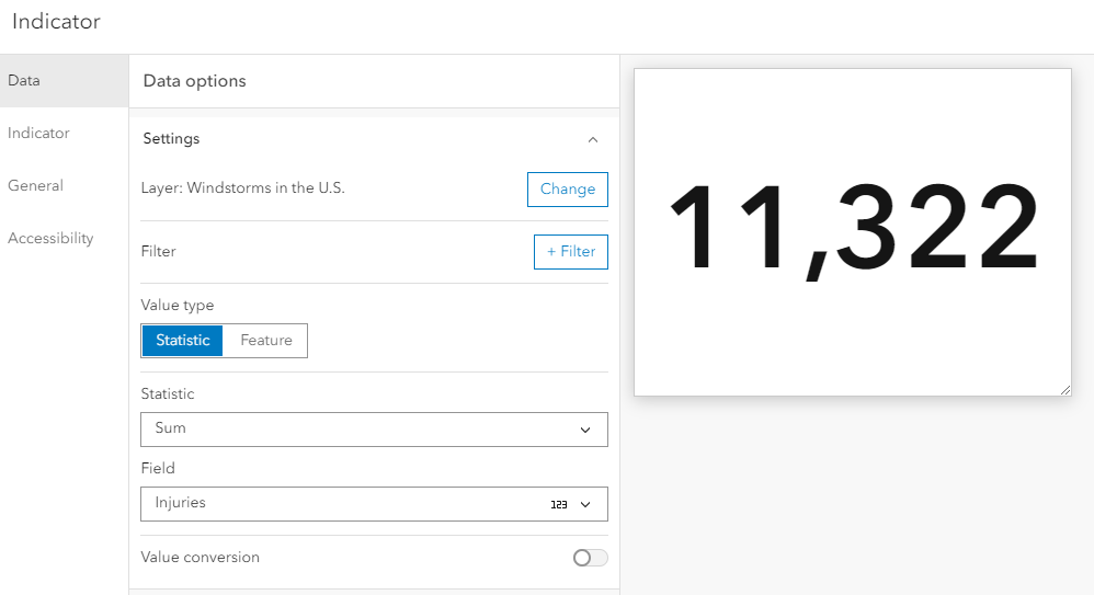
I used this Windstorms in the U.S. layer from NOAA. In the data there is a field for the number of people injured by a storm and a field for the number of fatalities. For this example, I wanted to display the total number of people injured or killed by storm.
First, I set up the indicator as usual:
- Layer: Windstorms in the U.S.
- Value type: Statistic
- Statistic: Sum
- Field: Injuries
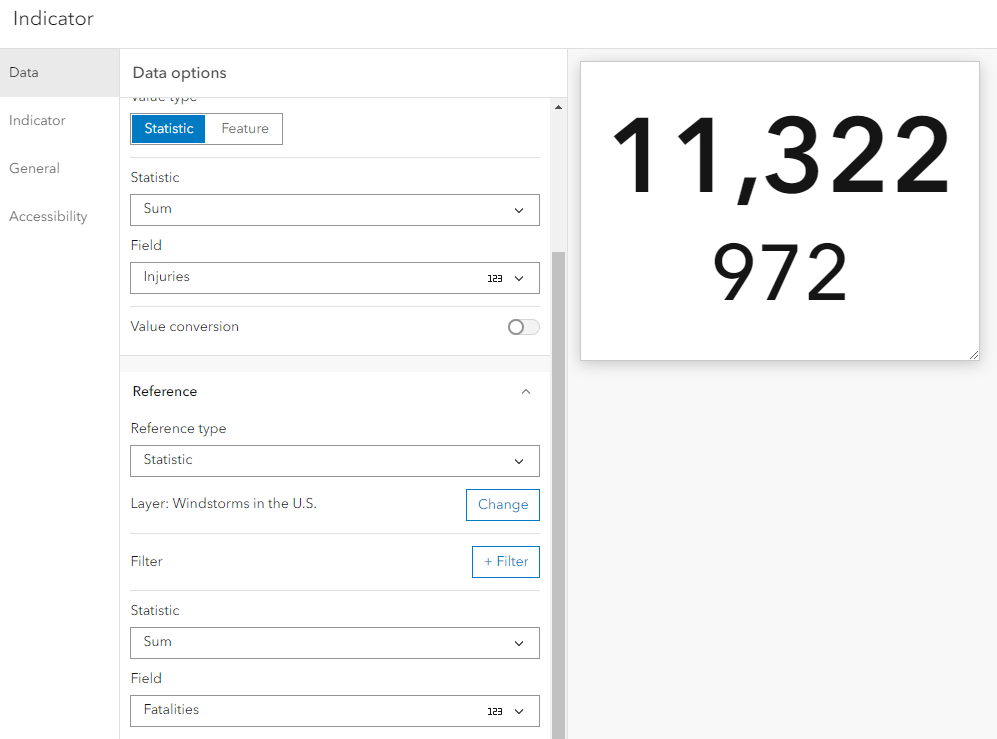
Next, I added my second field to the indicator.
I expanded the Reference section and set it up to pull from my second field:
- Reference Type: Statistic
- Layer: Windstorms in the U.S.
- Statistic: Sum
- Field: Fatalities
If we look at the indicator preview, we will see that our sum of injuries is on one line, and the sum of fatalities in on another. So, while we have both fields in our indicator, it’s not quite what we want.
Next, I moved into the Indicator tab.
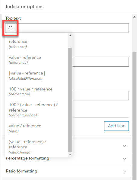
Thanks to that reference field, I was able to access some additional fields that are not typically available when using just a value. When I clicked on the curly brackets, I got the option to display:
- Difference
- Absolute Difference
- Percentage
- Ratio
- Ration Change
While those are certainly helpful, sadly there is no sum option. I had to create the summation myself using Advanced formatting and Arcade.
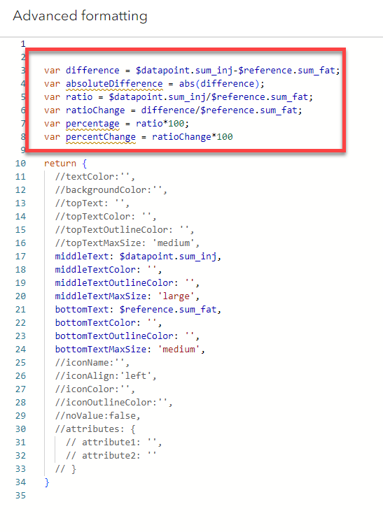
Once I enabled the Advanced Formatting, I was able to see the formulas used to create those additional reference fields.
This is super handy because instead of creating my summation arcade from scratch, I was able to modify the difference formula.
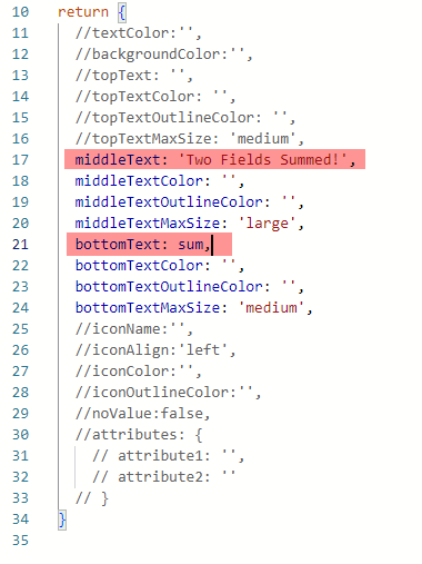
I copied/paste the difference line (line 3) into a new line.
Then I changed the variable name to sum and swapped the minus sign for an addition sign. Super easy.
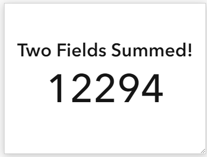
Now I just needed to adjust what text is returned....
And presto -
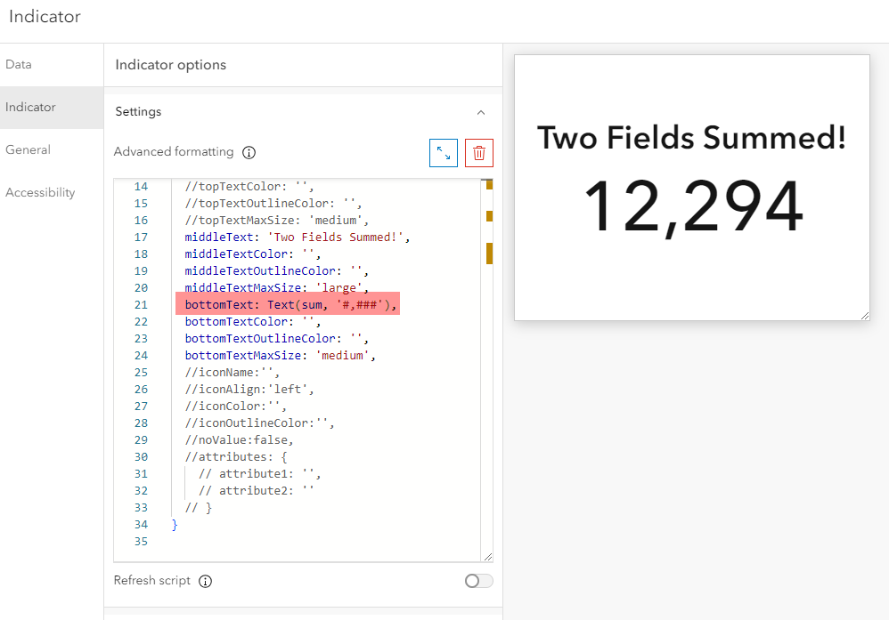
If you want to set up the number grouping, simply use the Text function.
Text(sum, '#,###')
Bonus
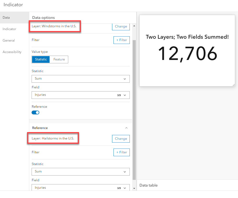
You can use this same set up to add fields from two different layers.
How can I display a date or text field?
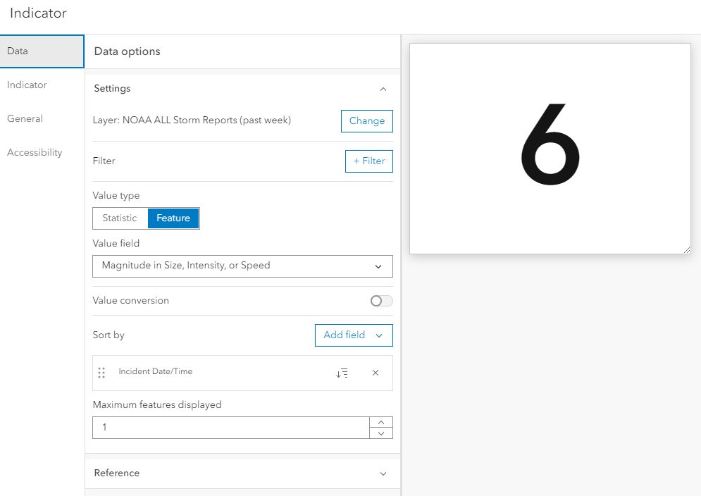
I see this a lot when folks want to use the Indicator to display when the data was last updated or edited. For this example I used this US Storm Events layer. To set this up, I used the Feature value type, and I picked a random value field in my data. It honestly doesn’t matter what numeric field I picked; I just have to have picked one. The only caveat being that you want a numeric field that doesn’t have any null values, otherwise you will get the No Data message.
I added a sort and used the date field that I want displayed as the sort field, order descending. That way the most recent date is displayed.
Then I set the Maximum features displayed to 1.
Next I went over to the Indicator tab and swapped out the {element/value} field for the actual field I want displayed.
How can I include dynamic text with my aggregation metric?
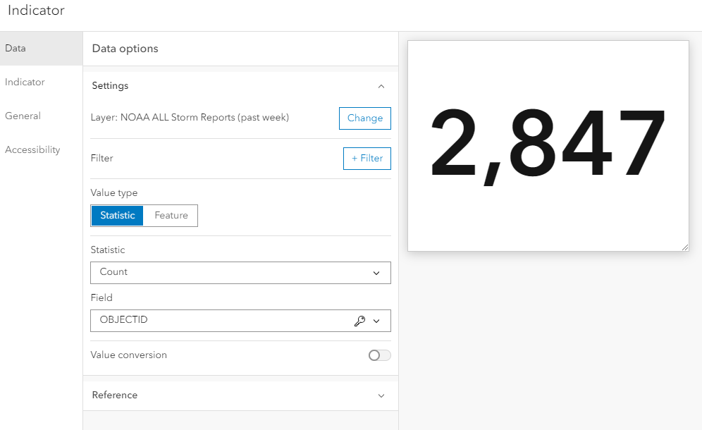
This method involves sneakily combining two indicators into one faux indicator. I started by building my event count indicator as normal.
Layer: NOAA ALL Storm Reports (past week)
Value type: Statistic
Statistic: Count
Field: Object ID
I am not going to add any text to this indicator, so I clicked Done and moved on to the second indicator.
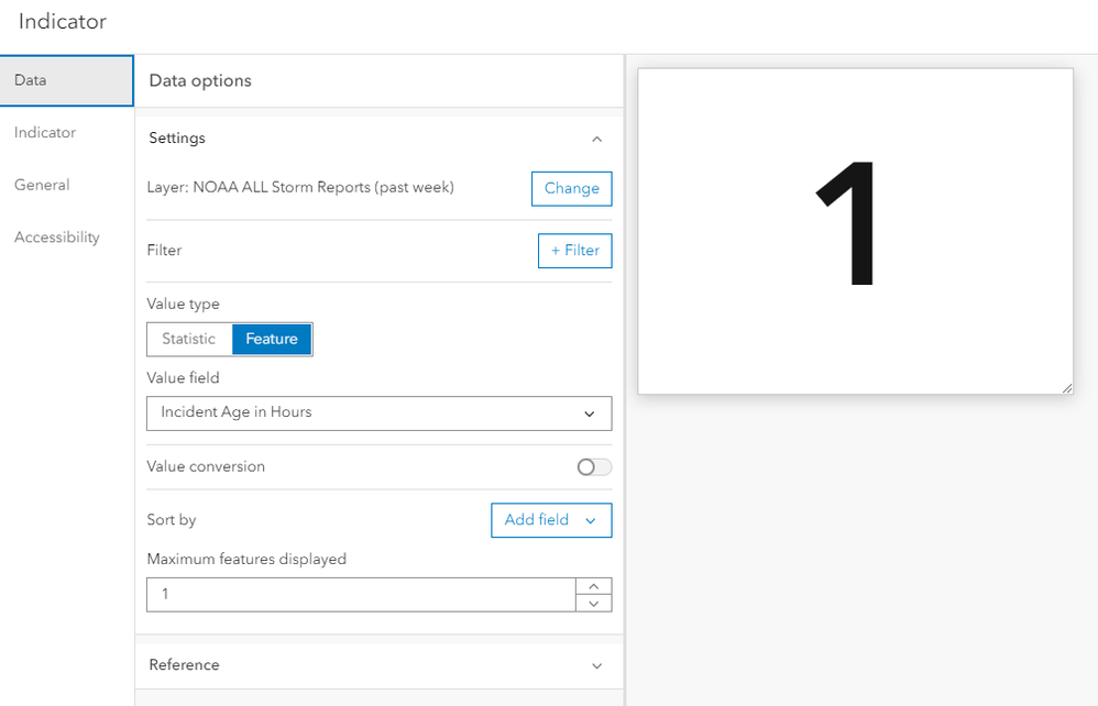
For this indicator, I will use the method I discussed in the second example above.
Layer: NOAA ALL Storm Reports (past week)
Value type: Feature
Value field: Randomly selected
Maximum features displayed: 1
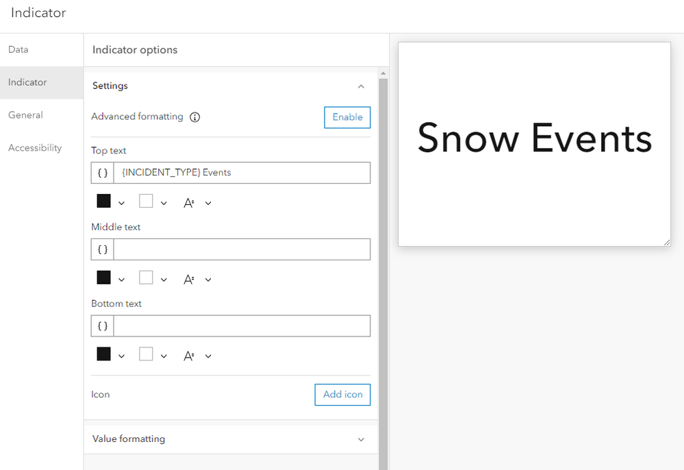
Next, I moved to the Indicator tab.
I removed the {element/value} field and replaced it with a mix of dynamic and static text: {INCIDENT_TYPE} Events.
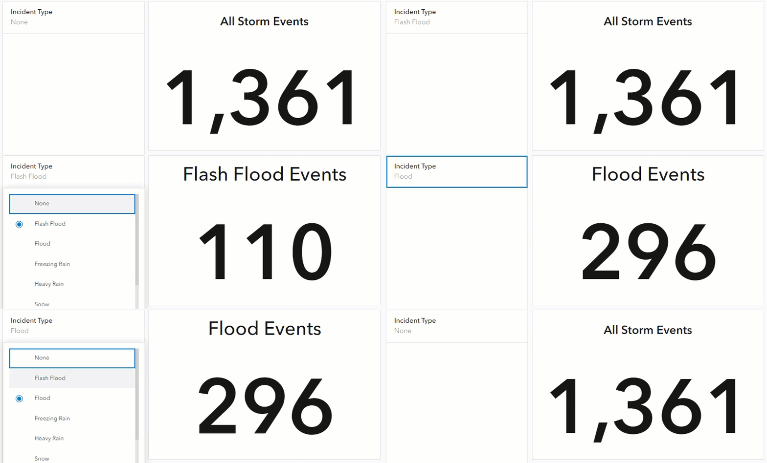
As users filter the dashboard by incident type, the text will dynamically change to display the type of events they have filtered for. This portion will only work when filtered, so I need to set up a value to display when an incident filter has not been applied.
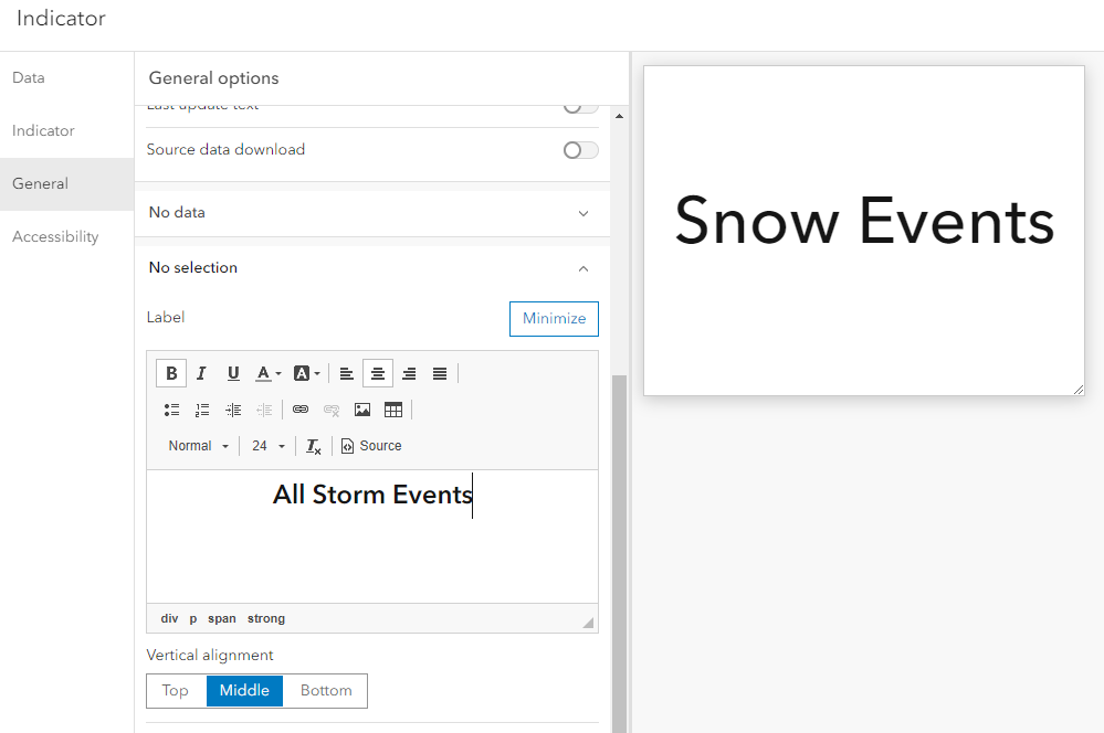
To do that, I moved to the General tab and set up a No Selection Label.
Done.
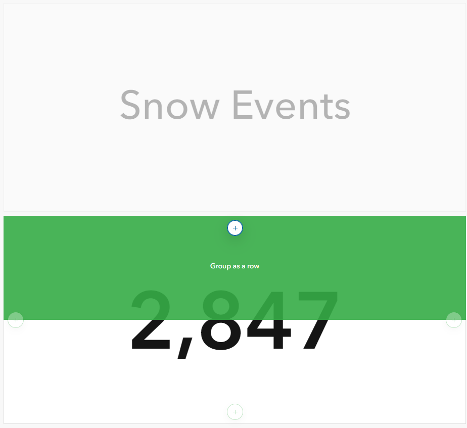
I am left with two separate indicators. To give the impression that they are a single indicator, I moved the text indicator to the value indicator while holding down the shift key to group them together.
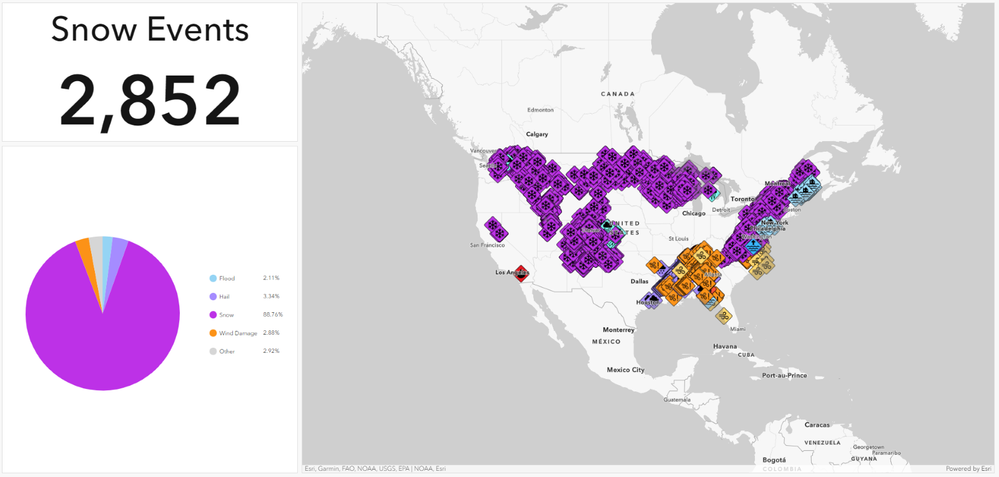
Looking at my dashboard in view mode, you can’t even tell that my indicator is really two separate indicators grouped together.
My final step is to add an Incident Type filter, so that my indicator text will display the correct information.
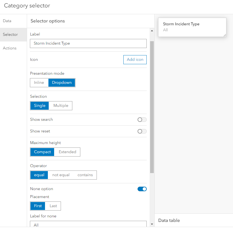
For this to work, I need my selector to use Single selection. This won’t work with a multiple selection selector.
I also added a None option and renamed it to All.
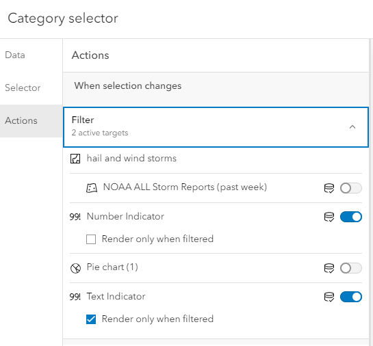
In the Action tab, I set up a Filter action targeted at my two indicators. I also set the text indicator to Render only when filtered. This will ensure that our ‘All events’ text is displayed when our data has not been filtered to a specific incident type.
Let’s see how that works.
For more real world Dashboard tips, check out the rest of my Dashboards that Pop series.
You must be a registered user to add a comment. If you've already registered, sign in. Otherwise, register and sign in.
