- Home
- :
- All Communities
- :
- Products
- :
- ArcGIS Dashboards
- :
- ArcGIS Dashboards Blog
- :
- Dashboards That Pop: Maps
Dashboards That Pop: Maps
- Subscribe to RSS Feed
- Mark as New
- Mark as Read
- Bookmark
- Subscribe
- Printer Friendly Page
- Report Inappropriate Content
Good dashboard design starts in your map. Your map should feel like an integral part of your dashboard, and not a separate thing just thrown in there.
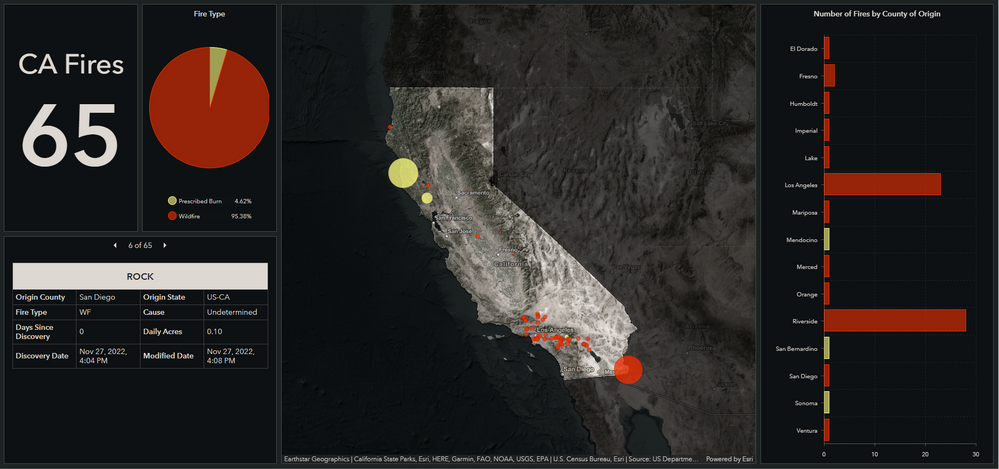
Here we have a relatively simple dashboard showing California fires using the Living Atlas’s USA Current Wildfires layer.
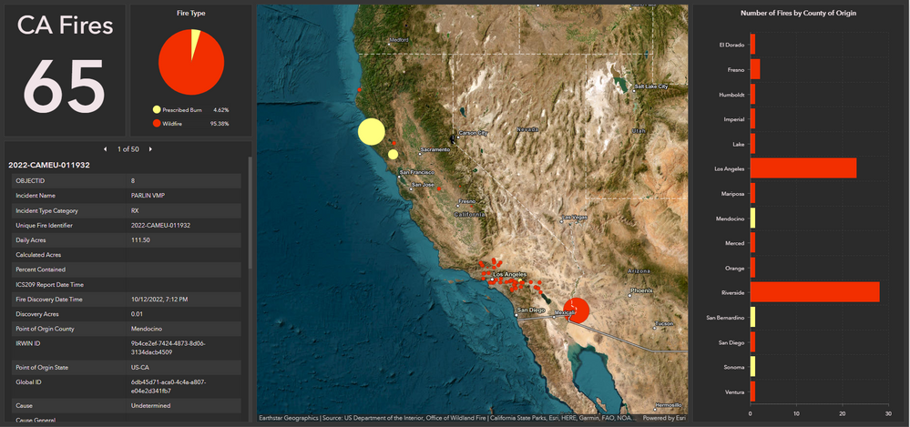
Here’s the same dashboard with a bit of map magic applied.

Let’s explore how we can spiff up dashboards by spending some time in the map.
Basemap
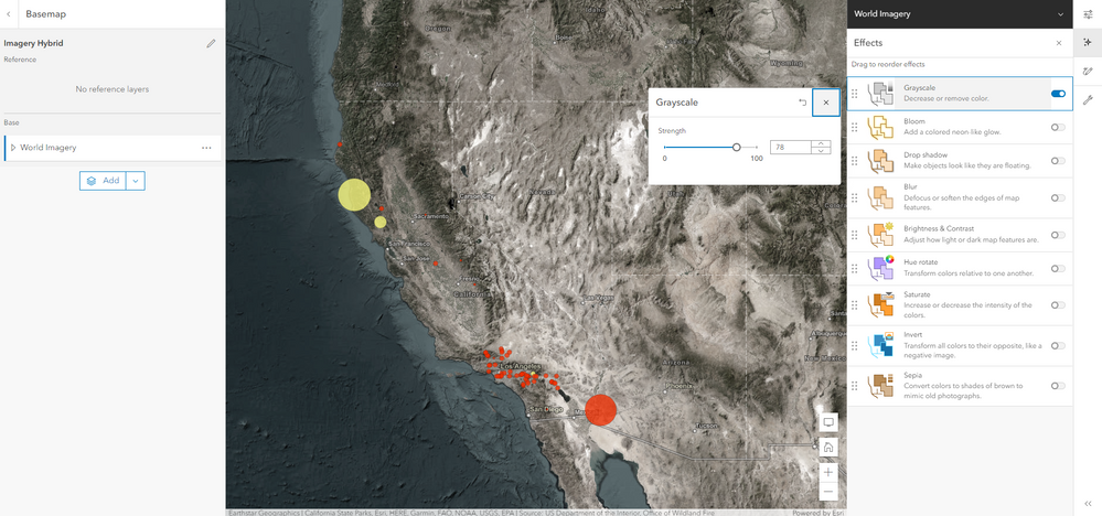
The original basemap is colorful and bright. It looks a bit out of place within our dark dashboard. I used the Grayscale map effect to tone down the color so only a touch of color is visible. For this map I set it to 78, but feel free to experiment with different values.
Map Blending Tricks
My dashboard only shows fires in California, so I used Allen Carroll’s Little World effect to focus on California.
I started by adding John Nelson’s Global Background layer and changed the fill color to #000000. I added a layer transparency of 32%.
Next, I added Esri’s USA Census States layer and changed the fill color to #FFFFFF with no outline.
I applied a filter to the States layer so only California is visible.
I grouped the two layers together so that the States layer is on top.
For the States layer, I applied the Destination Out blending mode.
Feel free to experiment with different values and colors to get the effect you want in your map.
Pop-Ups
Default pop-ups are definitely a pet peeve of mine. There are always unneeded fields included in them, the order doesn’t always make sense, and they are kind of boring. Spend a few minutes cleaning up your pop-ups, even if it’s just removing fields, reordering them, and ensuring your field names are cleaned up.
Dashboard Theme
Here’s our new fancy map in the default dark dashboard.
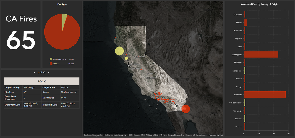
While my map certainly fits better than the original one, I took it one step further by using a color picker to pull colors from my map and into my dashboard theme.
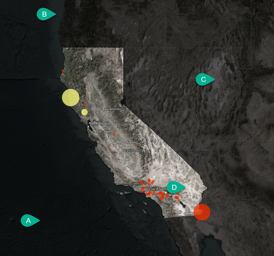
A) Element background
B) Dashboard background
C) Element border
D) Text Color
Here’s the final dashboard one more time to compare.
Bonus Blending Trick
The blending modes available in the Map Viewer are a super easy way to completely transform your basemaps. Don’t be afraid to just play with them and see what you can create. The Light Gray Canvas Basemap is completely unrecognizable in this Zombie themed Experience Builder app.
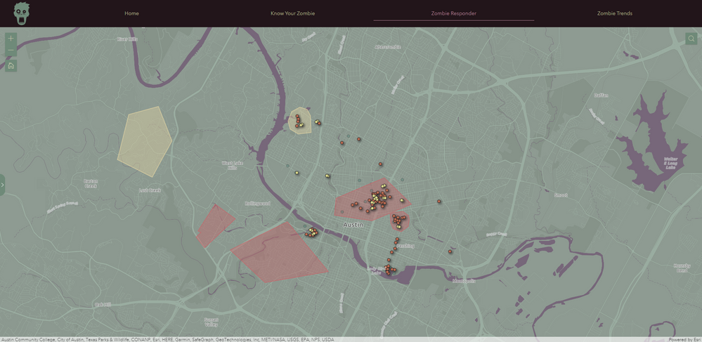
It only took two copies of the Global Background layer and some blending to create it.
The top global background layer:
- #6f8a79 Fill
- Darken Blending Mode
- 30% Transparency
The bottom global background layer:
- #422833 Fill
- Color Burn Blending Mode
- 49% Transparency
Happy dashboarding!
You must be a registered user to add a comment. If you've already registered, sign in. Otherwise, register and sign in.