- Home
- :
- All Communities
- :
- Products
- :
- ArcGIS for Power BI
- :
- ArcGIS for Power BI Questions
- :
- Create Boundaries Maps For Different Community in ...
- Subscribe to RSS Feed
- Mark Topic as New
- Mark Topic as Read
- Float this Topic for Current User
- Bookmark
- Subscribe
- Mute
- Printer Friendly Page
Create Boundaries Maps For Different Community in Calgary, Canada
- Mark as New
- Bookmark
- Subscribe
- Mute
- Subscribe to RSS Feed
- Permalink
- Report Inappropriate Content
Hello everyone,
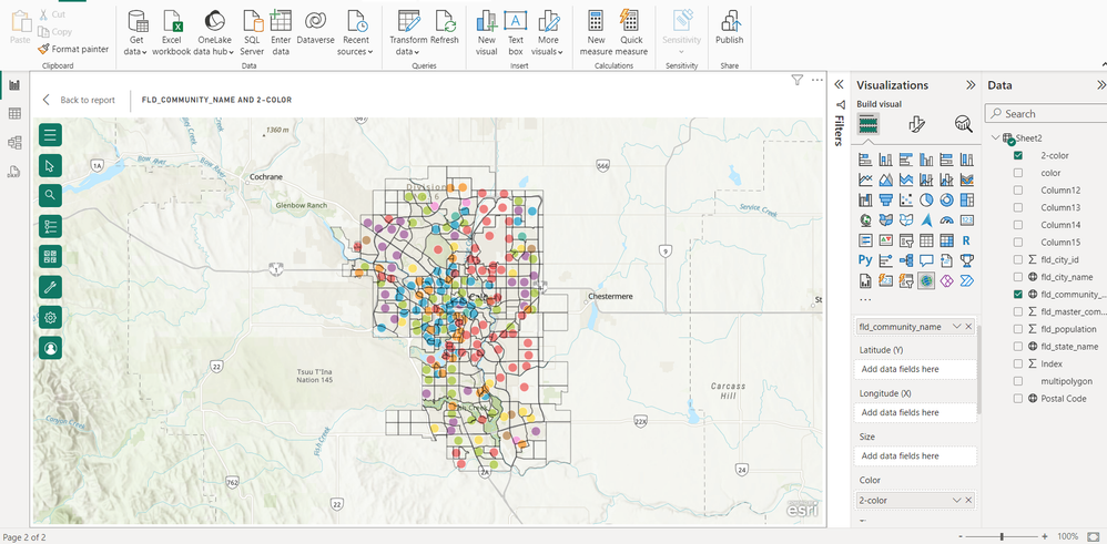
I'm new to GIS and working on a project that creates a choropleth map community level in Calgary, Canada using ArcGIS in PowerBI. I added the community name in the location tab but when I choose graduated colours in the symbology tab I don`t get a choropleth map, I just get a map with points.
My spreadsheet contains the province name, city name, community name, postal code, population, multi-polygon, etc.
Do I need data such as shape area, shape length, or any other data to get it right?
Pictures and dataset are attached.
Anyone out there to help? Forever grateful 😺
- Mark as New
- Bookmark
- Subscribe
- Mute
- Subscribe to RSS Feed
- Permalink
- Report Inappropriate Content
If you want to create custom shape features in ArcGIS for PowerBI, check this post: Shape in Geojson - Page 3 - Esri Community
And check your column[2-color] in color field. It might be a non-numeric format. If the column is for example text format, each different row would be seen as a different category, thus a distinct color. Change it to numeric format, you can get heat map.
