- Home
- :
- All Communities
- :
- Products
- :
- ArcGIS for SharePoint
- :
- ArcGIS for SharePoint Blog
- :
- Time animation in ArcGIS for SharePoint
Time animation in ArcGIS for SharePoint
- Subscribe to RSS Feed
- Mark as New
- Mark as Read
- Bookmark
- Subscribe
- Printer Friendly Page
- Report Inappropriate Content
Getting to know the Microsoft Integration team and their products like ArcGIS for SharePoint, ArcGIS for Office, ArcGIS for Teams and ArcGIS for Power BI has been a very rewarding experience for me. I get to play with some really cool functionality as I get more and more acclimated with the software. The biggest high for me is the realization of how empowering it is.
As a business owner trying to expand my business, or a student going through mounds of written data waiting to impress peers and teachers with infographics, or emergency personnel like the Police, Paramedics, Fire Fighters trying to understand just how much is within their vicinity and beyond - the ability to make maps from rows and columns of data which have geospatial information like addresses and X Y coordinates, is a powerful feeling.
People are visual learners and appreciate infographics more than pages of text. Many people think that making maps requires GIS expertise. The Esri collaboration with Microsoft now allows users to think beyond charts, tables, and shared documents! It makes skills like map making available to everyone. Using basic geospatial data like addresses, these apps familiarize people with the complexity, colorfulness and convincing power of maps, without being complex to use themselves.
This workflow uses ArcGIS for SharePoint 2021.1
What’s happening in the world of ArcGIS for SharePoint as of July 2021!
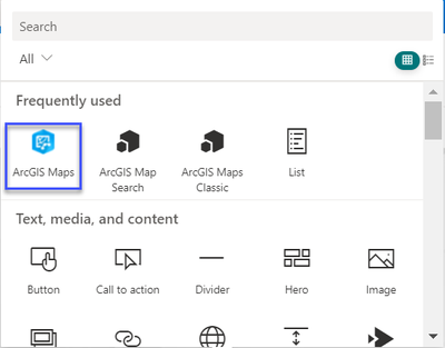
Get started with ArcGIS for SharePoint to get acclimated with the new UI:
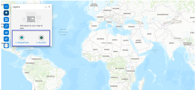
Add layers from SharePoint or ArcGIS.
Note: The data you want to add to your SharePoint is allowed only if the + is enabled. This depends on your data having information such as date, address, longitude, latitude. Most of us know of “geospatial” information like dates and addresses, so that’s a great start!
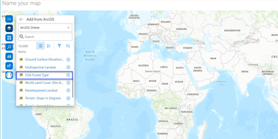
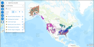
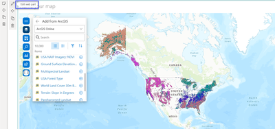
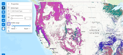
I am choosing USA Forest type. As soon as I add the layers, the data appears on my map.
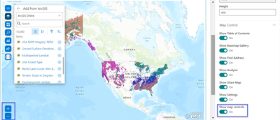
To zoom in/ zoom out of my map, I need to activate those buttons.
Click the Edit web part pencil icon. In the resulting ArcGIS Maps Appearance pane, I locate Show map controls and toggle the button to the right hand side.
I now want to see how the data changes over time.
Note: When you bring in data from any source, make sure it has date and time information. If your data contains temporal values (date), you can add a time-aware layer to a map and run an animation that shows how patterns in the data change over time.
The data/ layer of my choice isn't activating the Time button on the UI, so some time-aware information must be missing.
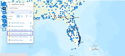
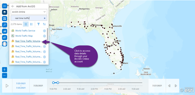
I go back to adding layer options from ArcGIS Online, enter specific search keywords, and choose a dataset with time attributes:
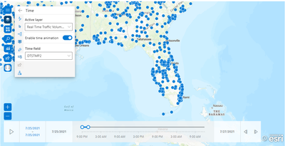
Because this data satisfied the “time” necessity, the Time option is now enabled. I move the toggle for Enable time animation to the right and could not only view the changes in data over time but even customize the time slider to define the time intervals shown.
Learn more about mapping time-aware data.
I can also check if the data I added indeed has the time information. For example if I add data from ArcGIS, I can click on the data link to view more details:
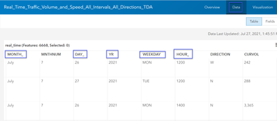
It takes me to my ArcGIS Online account where in the Data tab I can see where the SharePoint data is getting the “time” information from:
Note: If you are adding data directly from SharePoint, make sure you have such “time” sensitive information in it. For example, it could be from an Excel sheet.
This is great way to not only get used to what the July 2021 ArcGIS for SharePoint release has to offer, but also while playing with it, adding your own data and visualizing the various ways it manifests itself on the map. You can test what in that data can and cannot enable in the ArcGIS for SharePoint UI, while also checking and getting to know how that information affects your decisions!
It would be great to get feedback on this blog, was it effective, was it useful? Would you like to know about any other button, control or UI element that’s eluding you? I would love to co-test!
You must be a registered user to add a comment. If you've already registered, sign in. Otherwise, register and sign in.
