- Home
- :
- All Communities
- :
- Products
- :
- ArcGIS GeoStatistical Analyst
- :
- ArcGIS GeoStatistical Analyst Questions
- :
- Re: Spearman's rank or Pearson's correlation coeff...
- Subscribe to RSS Feed
- Mark Topic as New
- Mark Topic as Read
- Float this Topic for Current User
- Bookmark
- Subscribe
- Mute
- Printer Friendly Page
Spearman's rank or Pearson's correlation coefficient?
- Mark as New
- Bookmark
- Subscribe
- Mute
- Subscribe to RSS Feed
- Permalink
- Report Inappropriate Content
This isn't a GIS question so much but I'd like to correlate the percentage of the population of census output areas who are children with mean distances to green spaces, but am unsure whether to use Spearman's Rank or the Pearson's Correlation Coefficient. I understand that Spearman's rank is best used for ordinal variables, which I don't think either of these 2 are, so perhaps it's better to use Pearson's? But then I've also read that Pearson's is better used when the relationship between variables is linear which I'm not sure it is in this case, so I'm unsure which option's better. Any advice would be much appreciated.
- Mark as New
- Bookmark
- Subscribe
- Mute
- Subscribe to RSS Feed
- Permalink
- Report Inappropriate Content
why not categorize your variables into classes, the use a chi-square test of difference/association between the two variables. This would allow you to see whether areas with high percentages of children live in areas where the walk distance to green space is low. You aren't implying causality in this type of response, since I am sure that is not what is intended.
- Mark as New
- Bookmark
- Subscribe
- Mute
- Subscribe to RSS Feed
- Permalink
- Report Inappropriate Content
Thank you for your response. No I'm not intending to imply causality, I'd just like to investigate whether areas with higher percentages of children tend to have poorer or better access to green spaces, so yes, maybe chi squared would be better then. I'm completely new to this though because I haven't done a chi squared test before so I'm a bit uncertain about trying to do one since this is for my dissertation. When you suggest categorizing the variables into classes do you mean say dividing the percentages and distances into categories like for example 0-20%, 20-30% etc and 0-100 metres, 100-200 metres etc. Then would I cross tabulate these in a table to fill with counts of the number of output areas which fall within each category? Then use this to perform the chi squared analysis?
- Mark as New
- Bookmark
- Subscribe
- Mute
- Subscribe to RSS Feed
- Permalink
- Report Inappropriate Content
Yes as you describe. It may be useful to use existing classifications if they are available in the census categories, or you could use means and std devs to produce your classes or just subdivide the % data based upon some criteria of your choosing.
for example
high > =1 std dev
norm -1 std - 1 std dev
low < = -1 std
as an example should the distribution appear normal, this will give you some supportable criteria. Should the %age data not be normal, then you might want to examine the distribution to assess break points.
The key point is .... your categories, when derived from interval/ratio data, need to have some kind of justification! you could get the "how did you produce those classes" or "why did you choose those classes" questions (we examiners are not a cruel lot...just looking for thoughtful consideration and not a "because?!" person)
in any event, plot you data first to see if there is any clustering/pattern/ etc in the data, then do your descriptive statistics...then and only then, choose your inferential test. Parametric statistics has its requirements and if the data don't conform, then your non-parametric options (eg. chi) can step in.
Good luck and post more questions and/or graphs if needed.
PS I hope your advisor and committee are giving you similar advise.... take theirs over mine should there be a disagreement. If none is forthcoming, pose these issues with them...there are individuals that really don't care about appropriateness of the test and would say use pearson's but do it versus transformed data... eg log(%) versus sqrt(distance)+0.137 ... just so the distribution becomes 'normal'-ish  but that is another isssue
- Mark as New
- Bookmark
- Subscribe
- Mute
- Subscribe to RSS Feed
- Permalink
- Report Inappropriate Content
Ok then, thank you
My supervisor seemed to think that using either pearson's or spearman's would be ok, but wasn't sure which would be more appropriate.
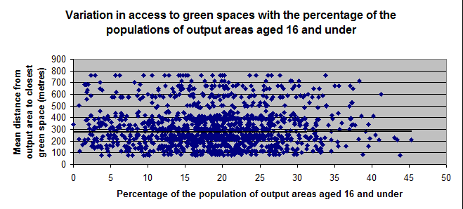
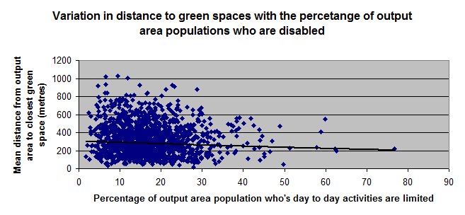
Can I just clarify that both my variables are ratio variables? If they are then I'm assuming that spearman's probably wouldn't be as appropriate to use as pearson's since spearman's is better used for ordinal variables? But I understand that variables have to vary linearly in order for pearson's to be carried out and I'm uncertain whether this is the case or not for mine? Here are the scatter diagrams I've plotted for them at the moment. I'm also measuring access for older individuals and those considered disabled, as well as for children.

Or if I transformed the data so that it becomes normal, as you describe, would it solve the data not being linearly related being an issue? I'm not too sure how to go about doing this though. Thank you.
- Mark as New
- Bookmark
- Subscribe
- Mute
- Subscribe to RSS Feed
- Permalink
- Report Inappropriate Content
Well... a quick look at the data would strongly suggest that regardless of the variables and the measurement level, there is no difference/association or correlation between them on face value. You could try grouping the data to see if there are clusters within the scatter plots. You could also try to map the data. Don't forget, that buried within that data may be the fact that some people may not be able to live close to green space regardless how much they may want to use it. A person's place of habitat is not a free variable since it is controlled by availability, cost and whole slew of other factors. Also, green space/ parks aren't able to be located freely in the landscape. So in short, you have two things that may be directly related, HOWEVER, they are unable to meet in the 'spatial middle' so that demand and supply is met.
I wouldn't spend too much time trying to prove anything with the inferential statistics...basically if you need to show, or are asked to show these data, don't spend much if any time desperately grasping at straws (ie the last graph and the outlier where block has 90% of the people over 65 and they live really really close to green space...perhaps there is a park directly across the street purely by coincidence)
- Mark as New
- Bookmark
- Subscribe
- Mute
- Subscribe to RSS Feed
- Permalink
- Report Inappropriate Content
Ok then, that makes sense. Thank you. No I'm not surprised that there doesn't seem to be clear relationships for any of the graphs. Would carrying out clustering analysis enable me to see whether there are areas with similar percentages of the social groups with similar access to the spaces?
But perhaps carrying out a statistical analysis won't be worthwhile at all then since the graphs show fairly clearly that there isn't a relationship between any of the variables. Or perhaps I could do one just to clarify that there isn't a relationship. I may just discuss how the graphs show that there are variations in access for both output areas with higher percentages and lower percentages of individuals from each of the groups. And I can discuss how the areas with higher percentages shown to have slightly poorer access are perhaps in the greatest need of improvements to access.
- Mark as New
- Bookmark
- Subscribe
- Mute
- Subscribe to RSS Feed
- Permalink
- Report Inappropriate Content
I would definitely produce a map showing the data... green space and some combination of the others. It may reveal more information than is given by the simple data points themselves. Start with something simple so one can see the pattern of where things are, where things can be then get a screen grab or two and post them. From there more ideas may come forth
- Mark as New
- Bookmark
- Subscribe
- Mute
- Subscribe to RSS Feed
- Permalink
- Report Inappropriate Content
Yes, I've actually already made some maps Here are the ones I've created to assess variations in access for the older individuals of the population, to identify areas which priority should perhaps be given to in improving accessibility. The first shows the percentages of the population of each output area who are aged 65 and above, as well as the distribution of green spaces. And the second shows the average distances to the closest green space for each output area.

It's a bit hard to compare them both though because of how many output areas there are and how small they are. But I suppose it can just about be seen that the average distance to the closest green space is fairly low for the only area with over 80% of the population over 65, being less than 400 metres. Then most of the areas in which 40-60% of the population are over 65 have slightly higher average distances of between 400-1200 metres. But most areas with poor access, over say 1800m, seem to have smaller older populations. So perhaps it could be said that, in this case, the distribution of the spaces seem to be reasonably fair in the sense that areas where access is poorer, above say 1200m, tend to have smaller populations of older people, if it's assumed that good access should be prioritised for older people. But I can use arcmap to analyse this a bit more carefully though by looking at the attribute tables for each variable.
I should probably change the classification colours for the second map so that it's a bit easier to distinguish between the categories for the output areas as well. And perhaps it would be good to combine both maps into one, but I can imagine this would be quite difficult to interpret and not very clear.
- Mark as New
- Bookmark
- Subscribe
- Mute
- Subscribe to RSS Feed
- Permalink
- Report Inappropriate Content
A couple of things.
- the classifications schemes are the result of? .... if I change it, the map will change... remember, lie with statistics, lie with maps
- dump the decimals
- percentage population is one thing...but...what is the absolute population? 6 elderly in an area with 6 is not the same as 6000 in an area with 6000, I will leave you to draw a conclusion
- older people are more likely to live in the same area for a longer period of time, hence the infrastructure builtup around them...if proximity to parks is such an issue why didn't they move to greener pastures?
- you will have to deal with the mobility issue at some point... ie can people move or locate freely within the landscape
- what are the impedances to locating green space? If we are talking parks, then there are areas that should be taken off the map...ie industrial parks, government enclaves, universities (unless these have publically accessible parks)
- what is the age distribution of greenspace? Is there any way to find out when parks were first created? I know that provision of greenspace where I live is a subdivision requirement. It is not distance based but driven by other factors.
- and on...