I thought I would blog about the Web App Builder Developer 1.2 that was released 8/12/15, but instead of re hashing whats the big new things in Web AppBuilder Dev, 1.2, I will focus on the little changes that may go unnoticed by some users. I want to cover the good and the bad changes (subjective of course). I have been using WAB since it was in Beta and have seen a lot of good changes and some regrettable ones, albeit very few.
So lets be start this on a positive note and talk about the good little changes.
How about the fact that there is a back button on the "Create New App" dialog
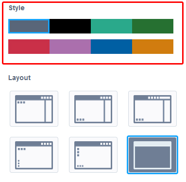
The default theme "Tab Theme" has 8 color options (Styles) now and 5 layout options (instead of 2)
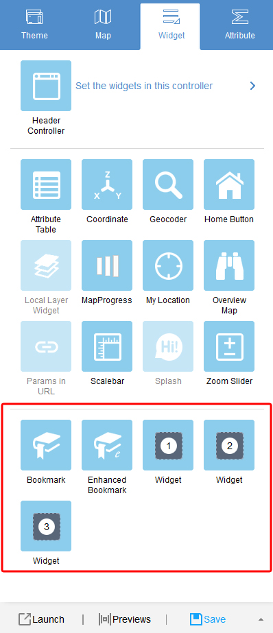
The default theme "Tab Theme" has 5 on screen widget placeholders (instead of 3)
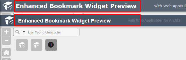
The main title font size had been increased by default.
The on screen widget place holders now have a thin black outline.
The on screen widget place holders now have a spinner to indicate they are loading the widget.
The on screen widgets are now grouped in a different spot on the widget tab.
Widgets now have a thin white border. Almost hard to see but against a dark background, wow it makes a difference.
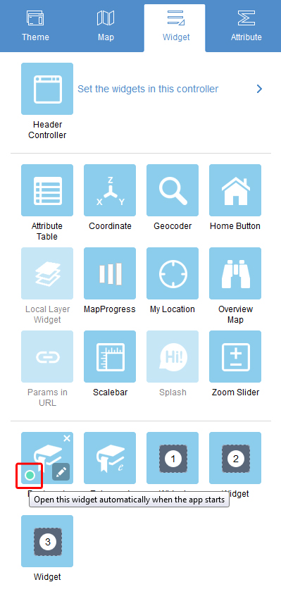
This one is a big one for me. There is now a way in the UI to set a widget to open at start.
Apps Logo can now be deleted.
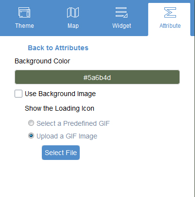
Loading screen can now be configured in the UI.
Map attribution font size has been decreased by default to allow for more to fit on screen.
Apps sub title font color contrasts more with the selected theme style color.
Now for the bad:
The font color of the coordinate widget is now lighter (subdued). This could actually go in the good list depending on your personal preference.
The zoom out negative sign shrunk for some reason and is smaller than the zoom in symbol.
The links in the Header have a horrible non-contrasting color applied to them (luckily this is just in the tab theme).
I am the GIS Manager for Calhoun County, Alabama. I have been an GIS Developer for nearly two decades. My areas of expertise is Web App Development, widget development, along with Javascript API Development and some occasional .Net development.