- Home
- :
- All Communities
- :
- User Groups
- :
- New to GIS
- :
- Questions
- :
- Hi,
- Subscribe to RSS Feed
- Mark Topic as New
- Mark Topic as Read
- Float this Topic for Current User
- Bookmark
- Subscribe
- Mute
- Printer Friendly Page
Hi,
- Mark as New
- Bookmark
- Subscribe
- Mute
- Subscribe to RSS Feed
- Permalink
- Report Inappropriate Content
I have block wise(polygon feature) attribute data of total population, male and female . How can I represent those data spatially which will reflect the comparison among blocks? (Pie, Bar, composite bar diagram inside a polygon is not applicable).
Please help......
- Mark as New
- Bookmark
- Subscribe
- Mute
- Subscribe to RSS Feed
- Permalink
- Report Inappropriate Content
That depends on what you are trying to present and who and how your trying to present to. The easiest to read would be displaying based on symbology with a color ramp(low to high) with a legend, but you could also use pie charts but they are harder to read the more data you have. You could also labels to show differences. It really depends on you and what is needed
- Mark as New
- Bookmark
- Subscribe
- Mute
- Subscribe to RSS Feed
- Permalink
- Report Inappropriate Content
Thanks...But color ramp is applicable for multiple map but if I want to present the attributes in single map then how it can be present??
- Mark as New
- Bookmark
- Subscribe
- Mute
- Subscribe to RSS Feed
- Permalink
- Report Inappropriate Content
When you use "View"->"Graph"->"Create Graph" Color = match with layer is the default.

Edit
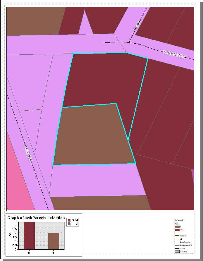
Here is a quick example
I selected two parcels and made a layer from the selection then created a graph from the layer file
- Mark as New
- Bookmark
- Subscribe
- Mute
- Subscribe to RSS Feed
- Permalink
- Report Inappropriate Content
Are you trying to compare each data type individually, or are you looking to compare them against one another, e.g. male to female ratio?
- Mark as New
- Bookmark
- Subscribe
- Mute
- Subscribe to RSS Feed
- Permalink
- Report Inappropriate Content
I want to compare each data type individually in one map...