Turn on suggestions
Auto-suggest helps you quickly narrow down your search results by suggesting possible matches as you type.
Cancel
- Home
- :
- All Communities
- :
- Products
- :
- Spatial Statistics
- :
- Spatial Statistics Questions
- :
- Interpret output maps from Generate Trend Raster (...
Options
- Subscribe to RSS Feed
- Mark Topic as New
- Mark Topic as Read
- Float this Topic for Current User
- Bookmark
- Subscribe
- Mute
- Printer Friendly Page
Interpret output maps from Generate Trend Raster (Image Analyst) tool in ArcGIS Pro
Subscribe
296
1
02-21-2024 10:16 PM
02-21-2024
10:16 PM
- Mark as New
- Bookmark
- Subscribe
- Mute
- Subscribe to RSS Feed
- Permalink
- Report Inappropriate Content
Hi!
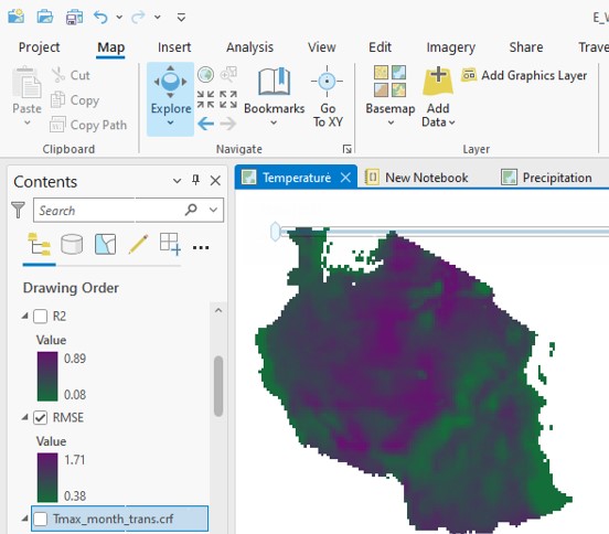
I would like your assistance in interpreting the output maps from Generate Trend Raster (Image Analyst) tool in ArcGIS Pro. In the attached is image of RMSE for temperature harmonic trend, ranging from 0.38 (green) to 1.71 (purple). Usually, the lower the value, the better the fit. But in the image what do the areas in purple tell us? Simillarly for R2, which ranges from 0.08 to 0.89.
Regards
1 Reply
02-22-2024
04:58 AM
- Mark as New
- Bookmark
- Subscribe
- Mute
- Subscribe to RSS Feed
- Permalink
- Report Inappropriate Content
R Squared tells you how well the model of the prediction fits the actual. You want as high of an R Squared as possible. Its range should be between 0 and 1 (0% and 100%). Areas with low R squared, you can't trust the predicted raster. Areas with high R squared you can trust more. I don't know anything about RMSE for Temperature Harmonic, so I don't know how to tell you to interpret your result, but based off of the fact that you say for the harmonic that a lower value is a better fit, then I would say the purple is a bad fit, but I feel you need someone in your industry to truly answer that question, however R Squared is works just like it does for Linear Regression in how you interpret it.
Robert “Edward” Gause, GISP | Director of Information Services | HTC | p 843-369-8483 | www.htcinc.net | This is life. Connet with it.