GIS Life Blog

cancel
Showing results for 
Show  only  | Search instead for 
Did you mean: 

Other Boards in This Place

Latest Activity

(450 Posts)
by Anonymous User
Not applicable

You've finally finished tracing the outlines of all of the buildings in your community, and now you want to visualize it. Sure, you could just leave those boring squares and circles on the page with some nice labels, but why not leverage Desktop Styles in ArcGIS Pro? Learn how these styles can quickly be downloaded and implemented in ArcGIS Pro in this #InAGIF! 

ArcGIS Pro style files allow you to incorporate designs from other cartographers.

ArcGIS Pro style files allow you to incorporate designs from other cartographers

Now there is no excuse for not having beautiful maps--you can thank ArcGIS user WarrenDz and Louis Hill @NKYmapLAB for that (and John Nelson for bringing it to my attention). This new style file contains sketch designs for trees, fountains, buildings, roadways, and even callouts. There are hundreds more available for download.


In this example, I have two layers: building footprints and trees. The footprints were acquired from a local government's open data portal. For the trees, I simply added a new polygon layer and created new circles from the editing pane. Once the new style was added, it appears as an option in the symbology pane. Check it out in the bonus .gif below. 

Creating the data for this demo was simple, leveraging Map Notes in ArcGIS Pro

Creating the data for this demo was simple, leveraging Map Notes in ArcGIS Pro

The Draft Sketch style can be downloaded here, and you can learn more about styles in this ArcGIS documentation.

more
1 0 3,379
by Anonymous User
Not applicable

Somehow or anotherI'm not asking any questionsyou've found yourself with an evidence bag full of cell phones belonging to suspected members of a crime syndicate. This leaves you with a few pieces of data that begin to tell a story:

  • The call logs belonging to those numbers
  • A directory of the owners of the confiscated phones

With ArcGIS Insights, we can link these phone logs together to form a network. This process may seem a little abstract, but stay with me, you only have to do it once. The model is also included for reference at the end of the article, as well as the sample dataset.

Build a call log link chart

Let's start with something simple: the call log table. In this case, we have combined the call logs from everyone in the suspected syndicate into a single table. Here we have two critical columnsthe number that dialed the call (i.e. the Owner), and the number that the call was placed to. 

A master file of all of the call logs gathered from the phones

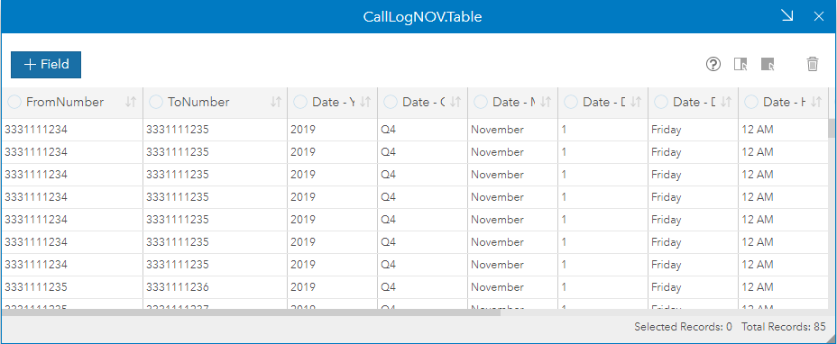
A call log table indicating From and To numbers

In ArcGIS Insights:

  1. Select two fields, in this case the From phone number and the the To phone number
  2. Drag them into the work space
  3. Hover over Chart and drop the data on Link Chart. If you don't see the Link Chart option, you may need to change your field types to String.
  4. In the layer options, hold down the shift key and select both nodes. This presents the option to Merge nodes
  5. Then select a Directed flow and a Hierarchical layout

Using ArcGIS Insights, we can create a link chart from the From number and the To number in the call logs.

The From and To numbers can be quickly added to a link chart to outline the structure of the calls

The chart below is already impressive. We see structure in the call logs, with certain numbers having more influence than others. For example, phone number (331) 111-1234 seems to be at the head of the organization, but phone number (333) 111-1235 makes connections to everyone else. 

A link analysis of just the cell phones

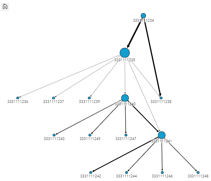
The resulting link chart from just the call logs

Build a caller link chart

What if someone in the syndicate "owned" more than one phone? Or what if you just wanted to present this evidence to a jury in a format that was easier to digest? Personally, I haven't memorized a phone number since 2005.

Let's take a look at our second piece of information, the phone number ownership table, which I will call The Directory from now on. This table contains the confiscated phone's number and its assumed owner. This table could have multiple numbers belonging to the same owner.

A table of the confiscated phone numbers and that phone

A directory of phone numbers and their assumed owners

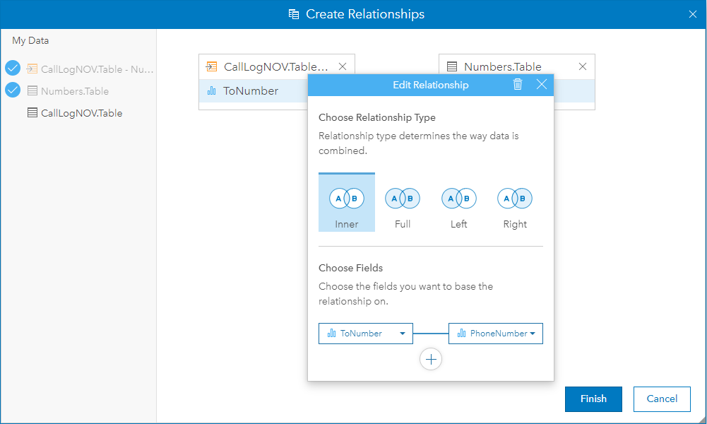
Our next step is to pair the From and To numbers with those numbers' owners in the directory so we can ultimately say "Bill called Carol" rather than "(333) 111-11234 called (333) 111-1235." 

In the Insights Create Relationships window, select the Call Log table, then select the number directory. In this first step, join the FromNumber field to the phone number field in the directory. As a result, a new field will be added to our call records indicating who made the call.

Join the From number in the call log to the name directory

Join the From number to the directory to get the name of the person who placed the call

Now we repeat the process above, but using the output of the last join. This time, we are going to join the ToNumber to the phone number in the directory. 

Like before, join the To number to the name directory

Join the To number to the directory to get the name of the person who received the call

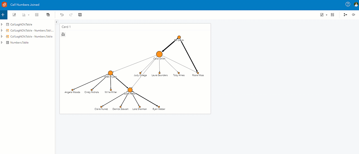
The result is below, a new table containing the FromNumber, To Number, Caller, and Recipient in the call logs. Immediately, this table is more human-readable. But what happens if we take these names and make a new link chart?

The result is a joined table of from and to numbers, with the associated phone owner names.

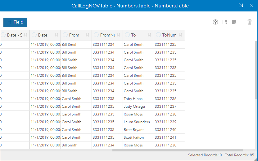
The resulting master join table, containing To and From names

In the window below, we follow the same steps as the first link chart, adding the data, merging the nodes, and selecting a hierarchical layout. Immediately our crime syndicate is laid out before us, showing a structure of call logs in an easy to digest format.

This new joined table allows us to make a new link chart of phone owners.

The new link chart containing human readable names and accounting for owners with multiple phone numbers

In this sample dataset, there were no owners with multiple phone numbers. If there were, we would see the nodes in the resulting link chart get condensed down as Insights takes account, like in the example below. Using the interactivity of ArcGIS Insights, you can even parse out which phone number that individual made calls from.

Once names are merged, it is revealed that two numbers belong to one person

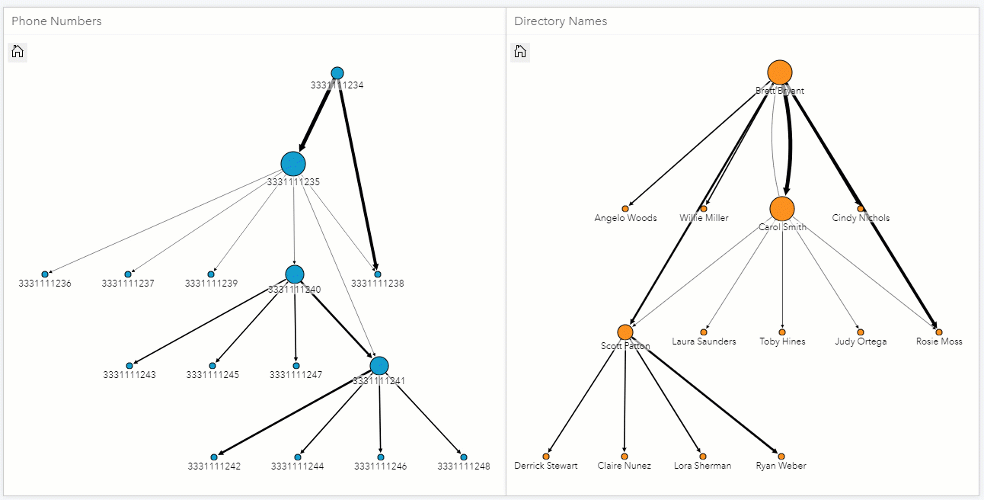
(333) 111-1234 and (333) 111-1240 have the same owner, and get merged in the new link chart

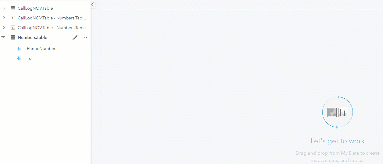
Import future investigations into the same model

[DEEP BREATH]

That was a lot. But the beauty of ArcGIS Insights is that you never have to do it again! By flipping to the model view, you have the option to import new data. This means when you get a new bag full of phones, you just need to import the new call logs and the new directory. The link chart will automatically be generated. While this example only uses a handful of records, you could import massive datasets and achieve the same results.

Export the model from this workbook to simply import the next investigation with no work.

Download this model now

Learn more about Crime Analysis in ArcGIS and ArcGIS Insights, and start importing your own data or use the sample dataset provided below.

more
3 4 1,365
by Anonymous User
Not applicable

Do you wish you could stack a whole bunch of indicators into a single tab in Operations Dashboard? Just hold down the SHIFT key when stacking two indicators!

Read more...

more
2 6 2,536
by Anonymous User
Not applicable

We've all done the "twitch" when comparing two mapslook at one map, then quickly look at another map to compare data, then back to the first map. You probably just did it, looking at the two maps below, trying to figure out where certain areas are dominated by renters or owners. You probably also twitched when you realized that the year 2000 was almost 20 years ago.

Side-by-side maps of renter and owner counts

Renters (blue) vs Owners (red) in the DC Metro Region, 2000

With new ArcGIS tech, you can get rid of the need to flip between maps and build an interactive visual of renters vs owners in under 45 seconds. Although this could also be a map of where your landlord won't let you use a turkey deep fryer on your patio this month. So no matter how you celebrate this holiday season, I think you'll enjoy the new dot density mapping feature in Map Viewer Beta. Let's get into it, in this week's #InAGIF.

Dot density maps improve visualization and more accurately depict data

The new Map Viewer Beta enables users to create high-performance maps in seconds

Dot density maps are fantastic for the comparison of demographic information. The above example uses data pulled from Esri's Living Atlas, an extremely diverse collection of authoritative data provided to users. This particular layer has two fields for counts of renters and owners by census boundary. Using the new Map Viewer Beta, we can select a dot density symbology with multiple fields. The tool then takes the data and recommends a color pallet that looks like a graphic design masterpiece. Best of all, it performs beautifully--pan, zoom, and click for a responsive design.


Additionally, dot density maps more accurately depict the distribution of the data. For example, if you had 50 fast food restaurants in all of Washington D.C. and 50 fast food restaurants in all of California, there are arguably "more" fast food restaurants in D.C. Dot density maps solve this problem by distributing the data out across the available space.

Dot density maps improve visualization and more accurately depict data

Learn more about the new Map Viewer Beta and start creating incredible products today! 

About In a GIF:

Every Friday, I take a few seconds of my day to demonstrate a cool feature of the ArcGIS platform, and share it with you all! The goal is to show how easy it is to create incredible products using tools available in the Esri environment.


We've all seen "look how easy this tool is to use" demos before, using curated data and copy-pasta code. So, to truly demonstrate going from zero-to-hero, In a GIF follows three simple rules:


 In a GIF Rules:

1) The .gif must be less than 45 seconds.

2) No cutting time from the .gif.

3) No pre-prepared code allowed.

more
0 0 761
by Anonymous User
Not applicable

I grew up on a rural farm in Maryland, and we had to live without the luxury of pizza delivery or readily-accessible fire serviceonly one of those mattered to me as a kid. While fast-food response times might not be critical insight for your community, it might be helpful to know the effective reach of services like fire stations or hospitals. Let's see what communities are underserved in this week's #InAGIF! 

Using Service Area analysis, we can discover underserved populations

Service Areas are the boundaries that outline the population served by a facility within a given time window
 

The tool used here is Generate Service Areas; it takes an input of facility locations (fire stations or pizza shops), and generates an area that can be reached from that point within a specified time. In this case, I've set the travel limit to 5 minutes without traffic. Once run, the tool pings Esri's authoritative dataset, scans the latest road data files, and finds the fastest routes away from the facility. You can even account for traffic on a particular day, based on historical data! The result is a polygon that can be used for further analysis. 

With this data, we can now answer questions like:

  • How many homes are outside of the 10-minute police response area?
  • Who in our community cannot reach our clinics in under 30 minutes?
  • Are some fire stations understaffed given the population size in their service area?

Or getting more advanced:

  • What special services are needed by a facility, given the surrounding demographics (like language) in the service area? And how are those demographics expected to shift over the next five years?

In this example, one fire station serves triple the population as another nearby, dictating staffing requirements.

Understanding your service area can lead to faster response times, improved service, and (maybe) fresher pizza.
Try it out today!

About In a GIF:

Every Friday, I take a few seconds of my day to demonstrate a cool feature of the ArcGIS platform, and share it with you all! The goal is to show how easy it is to create incredible products using tools available in the Esri environment.


We've all seen "look how easy this tool is to use" demos before, using curated data and copy-pasta code. So, to truly demonstrate going from zero-to-hero, In a GIF follows three simple rules:


 In a GIF Rules:

1) The .gif must be less than 45 seconds.

2) No cutting time from the .gif.

3) No pre-prepared code allowed.

more
1 0 724
by Anonymous User
Not applicable

Disclaimer: Save it for Mappy Hour. Don't plot and drive.

It “snowed” this Friday in Maryland, so there’s only one question on everyone’s mind: How bad is traffic going to be?! Leveraging free, curated data from Esri in a cloud environment, we can get the answer. Let’s find the common traffic hotspots in a heat map in this week’s #InAGIF.

Build a traffic hotspot map in seconds, then add your own data

With ArcGIS Online and Living Atlas, it is easy to create useful visualizations with no code or data

This visualization was created in ArcGIS Online, Esri’s cloud environment, using free Living Atlas data. That means it was built with no software installations, no data curation, and no coding. From here, it would be easy to add your organization’s own information like snowplow tracks, hospital points, field crew locations, and more. We could even add live weather data in a few clicks.

"No software installations, no data curation, and no coding."


For this example, I am adding the 2019 USA Traffic Counts layer from the Living Atlas. By changing the symbology to a heatmap visualization, I can find hotspots where the Most Recent Traffic Count is the highest. I prefer to add some light transparency to the basemap, also provided for free, is visible underneath.


Taking this example one step further, it could be added to an Operations Dashboard for your emergency operations center, or quickly placed in a mobile app for your community to stay informed.

App templates look great on mobile too!Adding any layer to a mobile application is easy and requires no coding experience

About In a GIF:

Every Friday, I take a few seconds of my day to demonstrate a cool feature of the ArcGIS platform, and share it with you all! The goal is to show how easy it is to create incredible products using tools available in the Esri environment.

We've all seen "look how easy this tool is to use" demos before, using curated data and copy-pasta code. So, to truly demonstrate going from zero-to-hero, In a GIF follows three simple rules:

 In a GIF Rules:

1) The .gif must be less than 45 seconds.

2) No cutting time from the .gif

3) No pre-prepared code allowed.

more
0 0 662
by Anonymous User
Not applicable

Show of hands: Who has been taking screenshots from Google when someone asks for a reference map? Oh wow, everyone raised their hands. What if you could make a reference map that looked like a graphic design masterpiece in almost the same amount of time? Lets make something beautiful in this week's #InAGIF.

Create high quality inset maps in seconds

The pièce de résistance here is the option to add a gradient stroke line as the border for a map frame. In this case, I am using a 50% grey fade to 100% white. This presents a shadow illusion in a few clicks. Paired with a pre-generated basemap (one of dozens available for free), we can create a professional-grade map with no graphic design experience. 

In ArcGIS Pro, you can quickly make beautiful reference maps to enhance your story.

Create this professional-grade inset map in seconds

The interface in this example is ArcGIS Pro, Esri's flagship desktop application. In this environment, you can quickly build incredible maps and products. For this particular example, a single point was added with a balloon label, but you could just as easily have added your own data from an existing spreadsheet.

For more cartographic inspiration on a time-budget, check out John Nelson's One Minute Map Hacks!

About In a GIF:

Every Friday, I take a few seconds of my day to demonstrate a cool feature of the ArcGIS platform, and share it with you all! The goal is to show how easy it is to create incredible products using tools available in the Esri environment.


We've all seen "look how easy this tool is to use" demos before, using curated data and copy-pasta code. So, to truly demonstrate going from zero-to-hero, In a GIF follows three simple rules:


 In a GIF Rules:

1) The .gif must be less than 45 seconds.

2) No cutting time from the .gif

3) No pre-prepared code allowed.

more
0 0 452
by Anonymous User
Not applicable

Due to your epic fiscal skills, your organization or community has a little bit of money left at the end of the year for a program. Maybe you want to set up a mobile clinic. Maybe you want to find a site for a technical training course for vulnerable populations. Or maybe you just want to have a better understanding of your town.

In just seconds, you can have all the insight you need to make smart, informed decisionsand beautiful, shareable infographics to show off! Let's dive into it in this week's #InAGIF!

Creating an infographic in seconds with ArcGIS Business or Community Analyst

Build an interactive, shareable infographic in seconds with ArcGIS Business or Community Analyst

The underlying tool here is ArcGIS Community Analyst (the same workflow applies to ArcGIS Business Analyst). This tool leverages thousands of authoritative layers available to Esri users to create stunning infographics and highly accurate insights. Users can access this tool entirely in a web browser, or in ArcGIS Pro as seen here.

Import infographics from a colleague and plug-and-play your own data.

Helen Thompson provides dozens of beautiful infographic templates that can easily be used in your community

Want to add your own style? Creating a custom template is a breeze with the Infographic Builder. Create your own, or import an existing template from your organization or a colleague.  

About In a GIF:

Every Friday, I take a few seconds of my day to demonstrate a cool feature of the ArcGIS platform, and share it with you all! The goal is to show how easy it is to create incredible products using tools available in the Esri environment.

We've all seen "look how easy this tool is to use" demos before, using curated data and copy-pasta code. So, to truly demonstrate going from zero-to-hero, In a GIF follows three simple rules:

 In a GIF Rules:

1) The .gif must be less than 45 seconds.

2) No cutting time from the .gif

3) No pre-prepared code allowed.

more
2 0 520
by Anonymous User
Not applicable

It's 6:00am on a Friday (yawn), and a stack of invoices has just been emailed to you, outlining all of the clients your employees need to visit today. What site should each of them start at? When will they get back to the office, accounting for traffic? How much are you expecting to spend on gas today? Lets get the answers to these questions in 45 seconds in today's #InAGIF!

Using the Find Routes tool, we are able to quickly import the client sites on the docket, and generate the fastest route between them. The tool provides options like the method of transportation (walking or driving), the time of day, the type of vehicle, and even toll road avoidance. You can also select what metric you want to monitor (travel time or mileage).

Quickly route though tens or thousands of addresses and determine the fastest route.

Find Routes can quickly solve massive routing problems

Using automation tools available in ArcGIS, this process can be easily automated for all 500 drivers every single morning, giving everyone their dispatch orders before your morning alarm even goes off. For an entire fleet, there are even tools that can evenly distribute stops to multiple drivers, ensuring everyone has a similar drive-time. 

If your data is sensitive, Esri also offers secure geocoding and routing tools, ensuring that your data never leaves your infrastructure. 

About In a GIF:

Every Friday, I take a few seconds of my day to demonstrate a cool feature of the ArcGIS platform, and share it with you all! The goal is to show how easy it is to create incredible products using tools available in the Esri environment.

We've all seen "look how easy this tool is to use" demos before, using curated data and copy-pasta code. So, to truly demonstrate going from zero-to-hero, In a GIF follows three simple rules:

 In a GIF Rules:

1) The .gif must be less than 45 seconds.

2) No cutting time from the .gif

3) No pre-prepared code allowed.

more
1 0 428
by Anonymous User
Not applicable

You've just added another record to "the table"—that one that your organization uses to store the billing addresses for your clients. Great job! But now have you considered how that new address relates to the other 10,000 in the table? Does it signal the emergence of a new hot spot of business? Or are you starting to see less business in a specific region due to unknown competition? Break your data out of "the table" and get ready for analysis in this week's #InAGIF.

If I had to give some order of operations to my gifs, this would be spot #1: getting your data out of a static format and making it dynamic using a process called geocoding. This process converts addresses into points on a map by matching them up against a database. In ArcGIS Online, it's as easy as drag-and-drop.

Geocoding a list rapidly converts addresses into points on a map

Geocoding is as easy as drag and drop

Compared to using a search engine to extract coordinates line-by-line, this is a game changer. While the drag-and-drop functionality is capped to a few thousand records, ArcGIS Online has other tools that can geocode massive datasets just as quickly, either in this interface or behind the scenes. There are also options for secure geocoding on-premise for health-related, sensitive, or big datasets.

Ok, so you've given your addresses some points on a map.... now what? Welcome to GIS.

Plotting points on a map is just the first step in GIS

Download this poster

About In a GIF:

Every Friday, I take a few seconds of my day to demonstrate a cool feature of the ArcGIS platform, and share it with you all! The goal is to show how easy it is to create incredible products using tools available in the Esri environment.

We've all seen "look how easy this tool is to use" demos before, using curated data and copy-pasta code. So, to truly demonstrate going from zero-to-hero, In a GIF follows three simple rules:

 In a GIF Rules:

1) The .gif must be less than 45 seconds.

2) No cutting time from the .gif

3) No pre-prepared code allowed.

more
1 0 2,311
65 Subscribers