- Home
- :
- All Communities
- :
- Products
- :
- ArcGIS Dashboards
- :
- ArcGIS Dashboards Questions
- :
- Re: Pie Chart and Bar Chart Widgets show incorrect...
- Subscribe to RSS Feed
- Mark Topic as New
- Mark Topic as Read
- Float this Topic for Current User
- Bookmark
- Subscribe
- Mute
- Printer Friendly Page
Pie Chart and Bar Chart Widgets show incorrect feature counts
- Mark as New
- Bookmark
- Subscribe
- Mute
- Subscribe to RSS Feed
- Permalink
- Report Inappropriate Content
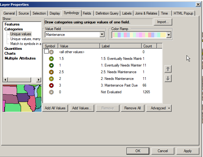
I have sanitary manholes that I have created two layers from. One layer is symbolized based off of a condition, the second layer is symbolized based off of repair status. I have no filters on my layers in my web map. I would like to create a Pie Chart showing the percentage of manholes that have a certain condition.
My manholes total 1355 and my condition value counts should be:
1265 manholes have 0-Not Evaluated
11 manholes have 1-Eventually Needs Maintenance
1 manhole has1.5-Eventually Needs Maintenance
11 manholes have 2-Needs Maintenance
1 manhole has 2.5-Needs Maintenance
66 manholes have 3-Maintenance Past Due
However, in Operations dashboard when I create either a pie chart or a bar chart for manhole condition, my counts are:
926 manholes have 0-Not Evaluated
10 manholes have 1-Eventually Needs Maintenance
1 manhole has1.5-Eventually Needs Maintenance
10 manholes have 2-Needs Maintenance
1 manhole has 2.5-Needs Maintenance
52 manholes have 3-Maintenance Past Due
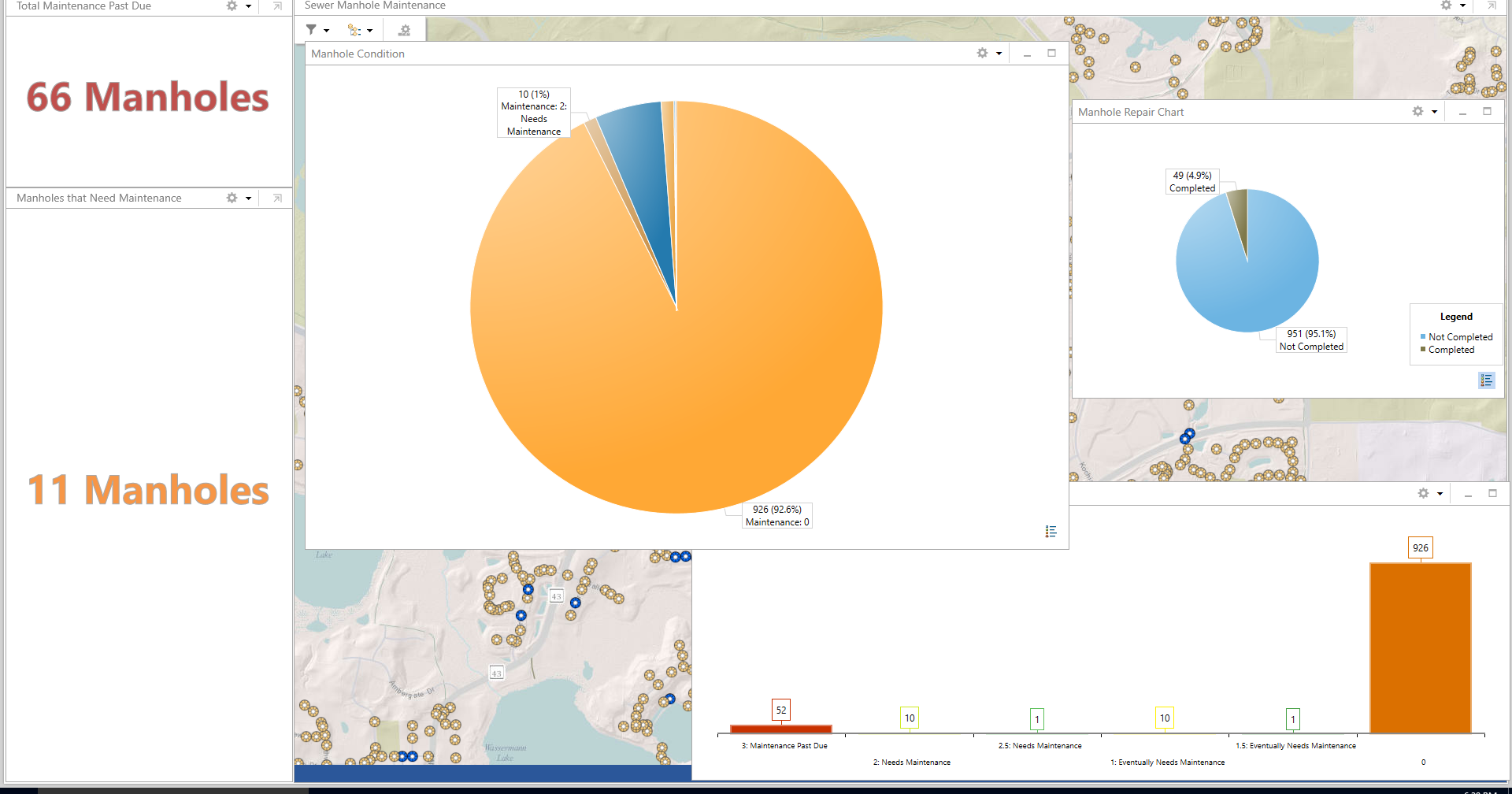
It appears to me that the pie chart and bar chart are performing some kind of filter. The Summerize Widget does show the correct count.
Each of my manhole conditions layer and my manhole repair status layers are part of a map service, however, they are referenced in my web map as individual feature layers.
Why are my totals off when I use a pie or bar chart?
Thanks!
Solved! Go to Solution.
Accepted Solutions
- Mark as New
- Bookmark
- Subscribe
- Mute
- Subscribe to RSS Feed
- Permalink
- Report Inappropriate Content
I found a post saying "Operations Dashboard is limited to displaying the number of features coming from the service. If the service is only set to 1000, that's all it will show." I therefore increased the number of features coming from my service from 1000 to 1500 and now all my counts correctly show in my pie and bar charts.
Thank you colsen-esristaff for your post.
- Mark as New
- Bookmark
- Subscribe
- Mute
- Subscribe to RSS Feed
- Permalink
- Report Inappropriate Content
Allison - I have a similar, but slightly different, problem. I have several feature services (e.g., Bus Stops, Pedestrian, Bicycle, etc.) that each have a field ("Inventory Status") that has several values (e.g., "Not Inventoried," "Updating Complete," "QC Complete," etc.).
I created a Bar Chart to track the Inventory Status for each layer in Operations Dashboard. The Bar Chart widget for each shows a maximum count of 1,000 although the actual # of features is 1,826. How did you "increase the number of features coming from my [feature] service"? I don't see where to do that in the Details for the feature service layers.
Here's a slight twist. One of my layers (Bus Stops) actually has only 232 features, but the Bar Chart widget for it also tops out at 1,000! No idea what that is about.
Thanks for your help.
Michael
- Mark as New
- Bookmark
- Subscribe
- Mute
- Subscribe to RSS Feed
- Permalink
- Report Inappropriate Content
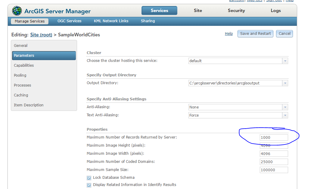
Go to arcgis server manager and change maximum number of records returned by server