- Home
- :
- All Communities
- :
- Products
- :
- ArcGIS Pro
- :
- ArcGIS Pro Ideas
- :
- Make Editing (Among other processes) Less Clunky a...
- Subscribe to RSS Feed
- Mark as New
- Mark as Read
- Bookmark
- Follow this Idea
- Printer Friendly Page
- Report Inappropriate Content
Make Editing (Among other processes) Less Clunky and Time Consuming
- Mark as New
- Bookmark
- Subscribe
- Mute
- Subscribe to RSS Feed
- Permalink
- Report Inappropriate Content
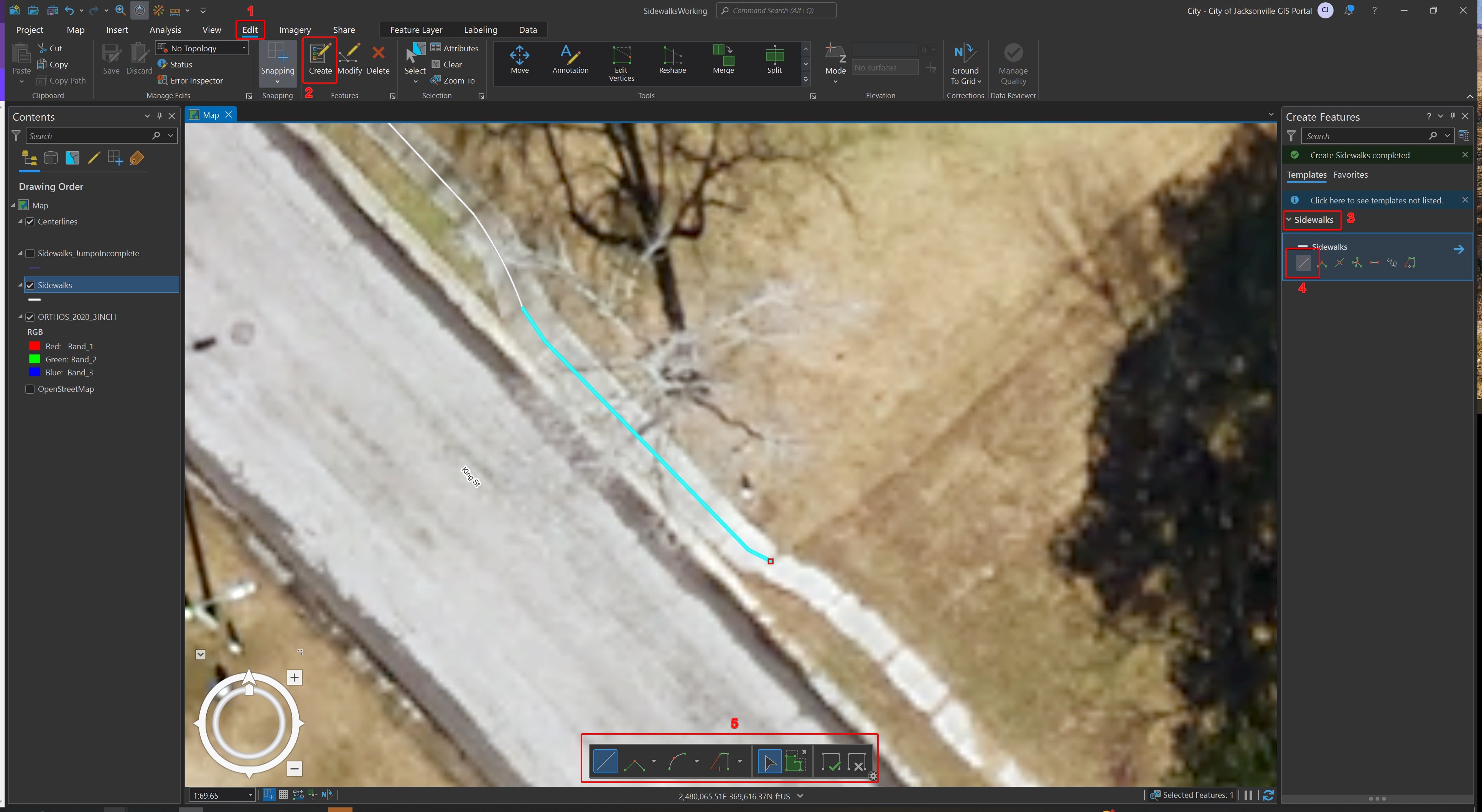
Editing is so much more clunky in Pro than in Desktop. To edit, I have to make sure I'm on the edit tab, clicking at the top of my screen. Then have to click create, then have to click over on the right side of the screen to select the layer I want to edit, then I have to select what kind of feature to select, and then if I want to change the type of feature, I have to click on the bottom of my screen. I feel like ESRI focuses more on making Pro look "pretty", than they do functionality and speed. As a CAD person for much of my career, when I'm digitizing data, I want to be able to be quick. Most of us use large monitors and having to click all over the place to complete simple tasks takes up far more time in Pro than in Desktop and is counter productive, particularly when just trying to digitize simple data.
As you can see in the screenshot below, that's a LOT of clicking.
- « Previous
-
- 1
- 2
- 3
- Next »
- Mark as Read
- Mark as New
- Bookmark
- Permalink
- Report Inappropriate Content
@hherrmann_coj Thanks for the feedback. Can you please provide a specific suggestion on how Editing in ArcGIS Pro can be more productive for you?
- Mark as Read
- Mark as New
- Bookmark
- Permalink
- Report Inappropriate Content
@Scott_Harris I've got some ideas - less of the contextual switching. Kill the ribbon and give us our toolbars back. In ArcMap, you could situate an editing toolbar on your screen and just go to town. It would never leave you and it wouldn't require a multi-click expedition to get started. Not only does the behavior described by @hherrmann_coj exist in Pro, but I also find the opposite happening - editing when I don't mean to be editing. It seems that if you have the create or modify features pane open whatsoever, I sometimes get switched into an editing tool when I just want to be selecting or something.
Can you imagine if your car keys only showed the unlock button sometimes? Or if a fire alarm pull station only showed a switch when it thought there was smoke? That would defeat the purpose, wouldn't it?
Agree with your points @hherrmann_coj about Pro being a major drag on efficiency all around.
- Mark as Read
- Mark as New
- Bookmark
- Permalink
- Report Inappropriate Content
Thanks for the feedback @wayfaringrob. I guess we can wait until @hherrmann_coj replies to find out what their Idea is for improving Editing productivity. If it's not the same, perhaps your suggestion(s) can be their own "Ideas".
---
RE: "I also find the opposite happening - editing when I don't mean to be editing. It seems that if you have the create or modify features pane open whatsoever, I sometimes get switched into an editing tool when I just want to be selecting or something."
One suggestion might be to check on 'Enable and disable editing from the Edit tab' in Editing options. Once you check it on, you can edit if the button is clicked on. Create and Modify are disabled until then:

- Mark as Read
- Mark as New
- Bookmark
- Permalink
- Report Inappropriate Content
I'm not sure why I can't add Kudos to this idea, so I'm adding a comment to remind myself to check back later. I'd like to follow this idea to see what kind of improvements are or can be added to the editing processes in Pro. I definitely feel like editing is slower for me in Pro than it is in ArcMap but I'm not sure if it's me or the program -- maybe I don't know some tips or tricks that can speed things up.
- Mark as Read
- Mark as New
- Bookmark
- Permalink
- Report Inappropriate Content
I agree with the feedback/suggestions here. I edit very detailed habitat maps which requires switching tools in rapid succession. I agree with bringing back floating tool bars and how easy it was to add and remove tools from tool bars from ArcMap.
I am sure all would agree that there needs to be an option to turn off animation flashing after edits ( there is a topic on this already https://community.esri.com/ideas/17830 )
I cannot add kudo either.
Thanks!
- Mark as Read
- Mark as New
- Bookmark
- Permalink
- Report Inappropriate Content
@ScottS I know you have but I feel like I should ask how much you've edited data in ArcMap vs ArcGIS Pro? Because I would think you might be able to answer those questions you're asking me.
To have to switch from multiple tabs through the "pretty ribbons" is such a cumbersome process. Like @wayfaringrob said, get rid of the ribbons. It feels like ESRI probably spends a lot on graphic artists to make all of the "pretty buttons" all over these cumbersome things too. LOL!
But on a serious note, going from the edit tab, to the table tab, to the analysis tab, to this tab, and that tab, and then from those, to clicking all over creation on the screen to get to the fly out window options for each of the above just really takes away sooo much time in terms of productivity. Thank goodness I'm not paid on production...eek! 😂
Also to mention, having to click save in multiple locations when editing data or tables...and constantly forgetting to hit "apply", or yet another window pops up asking you to confirm whether you want your changes saved or not, also reduces production. I know you can set it to autosave, but as in ArcMap, it just makes more sense to me to be able to start an edit session and have the option to have whatever toolbars open that you want, instead of having all of the fluff like Pro does.
As stated in my original suggestion, I'd be much happier editing in Pro if it was focused on functionality and not looks. (I have similar complaints about Portal, too. So much clicking and looking for things that should be way simpler).
Again, I come from a speed CAD architectural drafting environment and while it lead me to GIS which I absolutely LOVE as a profession, now that Pro is being forced, I can only hope that over time, some of these things that are kind of a pain in the tukus, will be resolved. ArcMap edits beautifully. I'd love to see some of that functionality in Pro.
@RoseF I bet it's because they moved it to "needs clarification". 😕 I just noticed that.
- Mark as Read
- Mark as New
- Bookmark
- Permalink
- Report Inappropriate Content
@hherrmann_coj entirely agree. If the ribbon must stay, I think AutoCAD is a good example to point out. I don't know if that's the CAD software you use, but in my experience with it, they've got things figured out. By making the buttons smaller (vs. Pro, where I've seen tabs with literally just three humongous buttons), they're able to show more commands on the screen, and most of those 'speed editing' commands live on a single Home tab. There is much less switching around, the tabs make much more sense, AND -- get this -- it supports floating and dockable toolbars as well. For the love of god, do something with the ribbon. It is a functionality nightmare.
- Mark as Read
- Mark as New
- Bookmark
- Permalink
- Report Inappropriate Content
@hherrmann coj @wayfaringrob
I agree with the toolbars. The ability to float a toolbar, able to customize how each tool looks and is worded. For ex. In ArcMap I edited Merge to just M to make my custom floating toolbar as small as possible. Having to go up to the docked toolbar is time consuming. When you do fine edits to habitat data, the time saved and the peace that settles in when all your tool bars are where they need to be is huge when factored in over time.
- Mark as Read
- Mark as New
- Bookmark
- Permalink
- Report Inappropriate Content
Also @Scott_Harris re: the suggestion about turning on the edit switch, you really shouldn't have to do that. If I have the selection tool active, I expect to be able to do just that and only that -- select. It becomes really confusing for users when one minute you have the selection tool on and the next you're editing vertices or something just because you happened to have the modify features pane open. What controls the application? Is it the active tool, or the visible pane? If I want to modify vertices, I'll go over and click that tool.
- Mark as Read
- Mark as New
- Bookmark
- Permalink
- Report Inappropriate Content
> What controls the application? Is it the active tool, or the visible pane?
The active tool is definitely controlling the application. The thing is that editing tools rather than making you switch to the selection tool to make a selection, for them to operate on, have (much like the edit tool in ArcMap) a built in selection mode which acts quite similar to the selection tool but filters the selectable features by the features that are valid for the active tool. This is why when the edit vertices tool is active and the current selection isn't valid (e.g. no or multiple features are selected) that the tool reverts back into a selection state for you to select a feature to edit vertices. In ArcMap these tools would likely either be disabled (or worse yet show a modal dialog saying the selection was bad). In Pro the tool just asks "Okay what do you want to modify?" and after you answer that question (by selecting the feature to modify) it gets to work. It does indeed look similar to the core select features tool because they are both asking the same question, but once a selection is made the select features tool will just sit there and say "Let me know when you want to select again" while the Pro editing tools will move on and start trying to do their work on that selected feature.
You must be a registered user to add a comment. If you've already registered, sign in. Otherwise, register and sign in.