- Home
- :
- All Communities
- :
- Products
- :
- ArcGIS Pro
- :
- ArcGIS Pro Questions
- :
- Re: Symbol raster using discrete bins
- Subscribe to RSS Feed
- Mark Topic as New
- Mark Topic as Read
- Float this Topic for Current User
- Bookmark
- Subscribe
- Mute
- Printer Friendly Page
- Mark as New
- Bookmark
- Subscribe
- Mute
- Subscribe to RSS Feed
- Permalink
- Report Inappropriate Content
I have a raster of continuous data. Single band, sid format. I need to symbolize it by discrete colors with each color corresponding to a range of values, ie bin it. There used to be an easy way to do this in ArcMap with the classify symbology, it was buried somewhere in the histogram if I recall correctly, but it was quite simple. You could just tell it how many ranges you wanted, set the breaks and that was it. I can't find anything to do this is Pro. Is this still possible in Pro? I can get to the historgram but it doesn't appear to have the options I need I just want to bin the data, not transform it.
Solved! Go to Solution.
Accepted Solutions
- Mark as New
- Bookmark
- Subscribe
- Mute
- Subscribe to RSS Feed
- Permalink
- Report Inappropriate Content
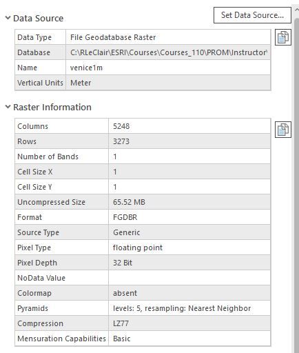
GREAT! Okay, next step. Here is my Data Source and Raster Properties below. I'm thinking you're working with a raster dataset that has more than 1-band. That's why you're seeing RGB, Stretch and Vector symbology options.
- Mark as New
- Bookmark
- Subscribe
- Mute
- Subscribe to RSS Feed
- Permalink
- Report Inappropriate Content
- Mark as New
- Bookmark
- Subscribe
- Mute
- Subscribe to RSS Feed
- Permalink
- Report Inappropriate Content
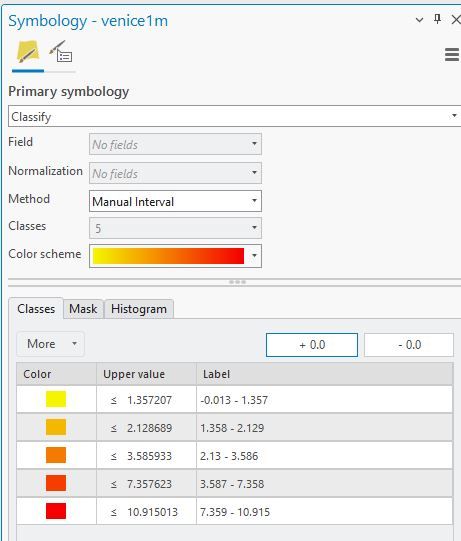
So if I'm understanding the question correctly, you want to break the symbology of a continuous raster dataset into say 5 classes for discrete colors. If this is the case, click the raster layer in the Catalog Pane, then you'll see a contextual tab on the ribbon that says Raster Layer. On the Raster Layer tab, in the Rendering group is the Symbology tool. Click that. In the Symbology Pane, select Classify for the Primary symbology, choose your classification method, set the number of classes you want, choose your color scheme. On the classes tab, you can set the upper value for each class or click the Histogram and manually set them there too.
- Mark as New
- Bookmark
- Subscribe
- Mute
- Subscribe to RSS Feed
- Permalink
- Report Inappropriate Content
- Mark as New
- Bookmark
- Subscribe
- Mute
- Subscribe to RSS Feed
- Permalink
- Report Inappropriate Content
GREAT! Okay, next step. Here is my Data Source and Raster Properties below. I'm thinking you're working with a raster dataset that has more than 1-band. That's why you're seeing RGB, Stretch and Vector symbology options.
- Mark as New
- Bookmark
- Subscribe
- Mute
- Subscribe to RSS Feed
- Permalink
- Report Inappropriate Content
Yep, this raster shouldn't have two bands but does for some reason. Thanks!
- Mark as New
- Bookmark
- Subscribe
- Mute
- Subscribe to RSS Feed
- Permalink
- Report Inappropriate Content
Certainly! There is an ArcMap Support article that discusses how to extract a single band from a raster. You can access it here. I would imagine ArcGIS Pro has the same GP tools to run as in ArcMap.
- Mark as New
- Bookmark
- Subscribe
- Mute
- Subscribe to RSS Feed
- Permalink
- Report Inappropriate Content
- Mark as New
- Bookmark
- Subscribe
- Mute
- Subscribe to RSS Feed
- Permalink
- Report Inappropriate Content
Yes, it is still possible to symbolize raster data by discrete colors according to value ranges (binning) in ArcGIS Pro, similar to what you could do in ArcMap. The process in ArcGIS Pro is slightly different but still straightforward once you know where to look. Here's how you can achieve this:
Steps to Symbolize Raster Data by Discrete Colors in ArcGIS Pro
Add Your Raster Data:
- Start by adding your .sid raster dataset to a new or existing map in ArcGIS Pro.
Open the Layer Symbology:
- Right-click on the raster layer in the Contents pane.
- Choose “Symbology” from the context menu. This will open the Symbology pane for the layer.
Change the Symbology Type:
- In the Symbology pane, you will initially see the raster displayed with a default symbology, likely a stretched color ramp.
- Change the symbology type by selecting the “Classified” option from the list of available symbology types. This option allows you to define classes or bins.
Define Classes and Set Breaks:
- Once “Classified” is selected, you can specify the number of classes you want to create. This directly corresponds to the number of bins or color categories for your data.
- Click on the “Classify” button to open the Classification dialog where you can set the method and the number of breaks. Common methods include natural breaks (Jenks), equal interval, quantile, etc.
- You can manually adjust the class breaks by entering the values or using the histogram displayed within the dialog.
Customize Class Colors:
- Back in the Symbology pane, you can customize the color for each class by clicking the color patch next to each class range and selecting a new color from the color picker.
Apply and Save:
- Click “Apply” to see the changes on your map.
- Save your project to retain the symbology settings.
Additional Tips
- Histogram View: If you want to view the histogram to better decide on your breaks, you can find it under the “Classify” dialog when setting up your classes in the Symbology pane.
- Legend: Don’t forget to update your legend in the layout view if you are preparing a map for presentation or publication.
ArcGIS Pro's interface differs from ArcMap, with many options becoming more streamlined or appearing under new menus. The capability to classify raster data is robust in Pro, offering flexibility and control over how your data is visualized.
<a href="https://birdfeederworld.com/">birdfeederworld!</a>


