- Home
- :
- All Communities
- :
- Products
- :
- ArcGIS Viewer for Flex (Retired)
- :
- ArcGIS Viewer for Flex Questions
- :
- Display XY coordinates at a designated location
- Subscribe to RSS Feed
- Mark Topic as New
- Mark Topic as Read
- Float this Topic for Current User
- Bookmark
- Subscribe
- Mute
- Printer Friendly Page
Display XY coordinates at a designated location
- Mark as New
- Bookmark
- Subscribe
- Mute
- Subscribe to RSS Feed
- Permalink
- Report Inappropriate Content
Hi all,
I need to display a plume shape generated by a dispersion model into ArcMap at a designated place. The plume is shaped by points with xy coordinated. I have imported these points into ArcMap as both dbf file and shape file. However, I have trouble locating the shape on the designated place. I have the lat and long of the origin for the layer. Could anyone please help me with this issue? Thanks!
Solved! Go to Solution.
Accepted Solutions
- Mark as New
- Bookmark
- Subscribe
- Mute
- Subscribe to RSS Feed
- Permalink
- Report Inappropriate Content
Juan,
If your dispersion model generated a point of origin with a full Lat and Long and the rest of the coordinates are just offsets for the point of origin, there is no easy way to add this like you would normally using "Add XY Data" in ArcMap.
I have a Flex Viewer widget for Aloha plumes http://www.arcgis.com/home/item.html?id=06e2c33649c34c478a15dace967d0cdd That does this in the Flex Viewer.
"Add XY Data" is expecting a list of full coordinates, not offsets from a point of origin. You would have to script something to handle this.
- Mark as New
- Bookmark
- Subscribe
- Mute
- Subscribe to RSS Feed
- Permalink
- Report Inappropriate Content
Hello Robert,
Thank you very much for your quick response. Now I have a question about the ALOHA ArcMap import tools. I think that you are probably also familiar with this dispersion software.
Actually I was using ALOHA for simulating the dispersion of a hypothetical chemical mixture release. I downloaded their ArcMap Import Tools from this link (ArcMap 10.0 version) http://response.restoration.noaa.gov/oil-and-chemical-spills/chemical-spills/resources/aloha-arcmap-... and I successfully imported .pas files to the ArcMap. Howerver, after displaying the plume polygon on the map, I found that the centerline of the polygon is longer than it is supposed to be.
For example, in ALOHA display page, one chemical plume can reach as far as 6.1 km (yellow area in Figure 1).
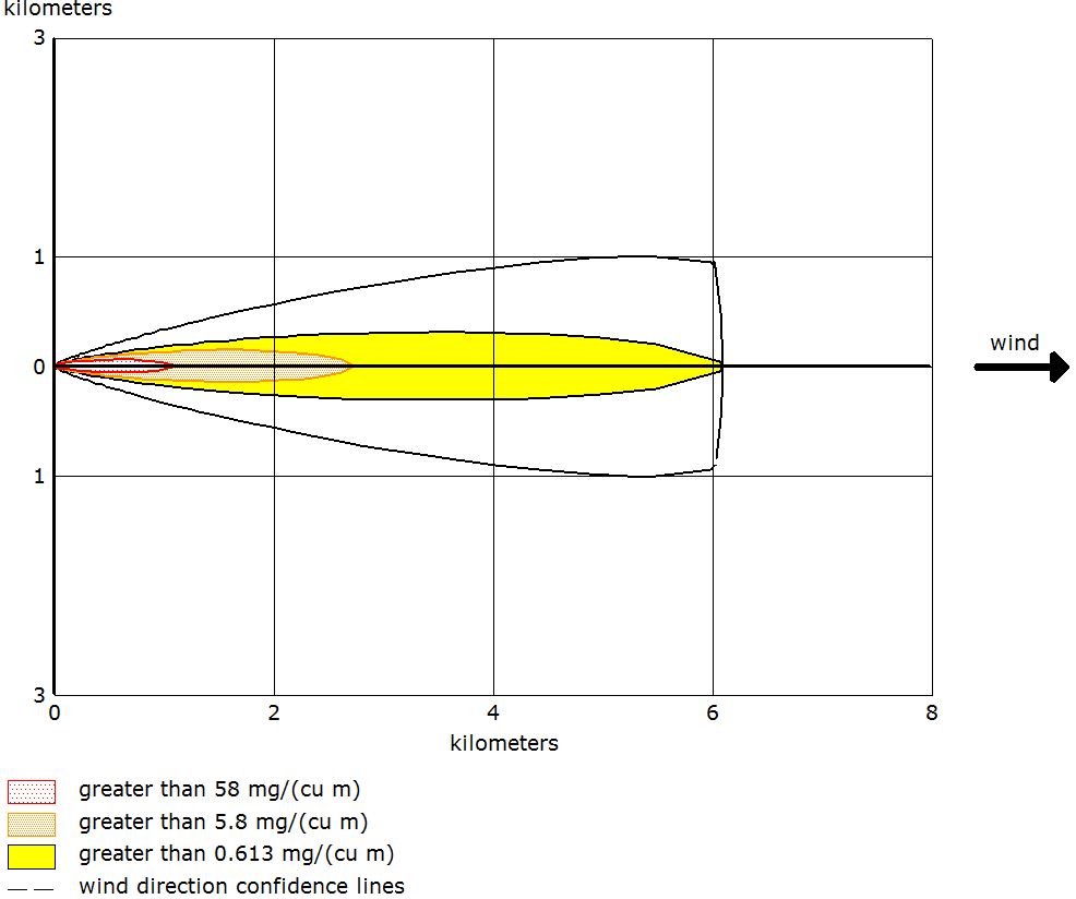
Figure 1. threat zone displayed in ALOHA.
Once this plot is imported into ArcMap, the centerline of the yellow area is 8.8 km (Figure 2) estimated by "measure" tool.
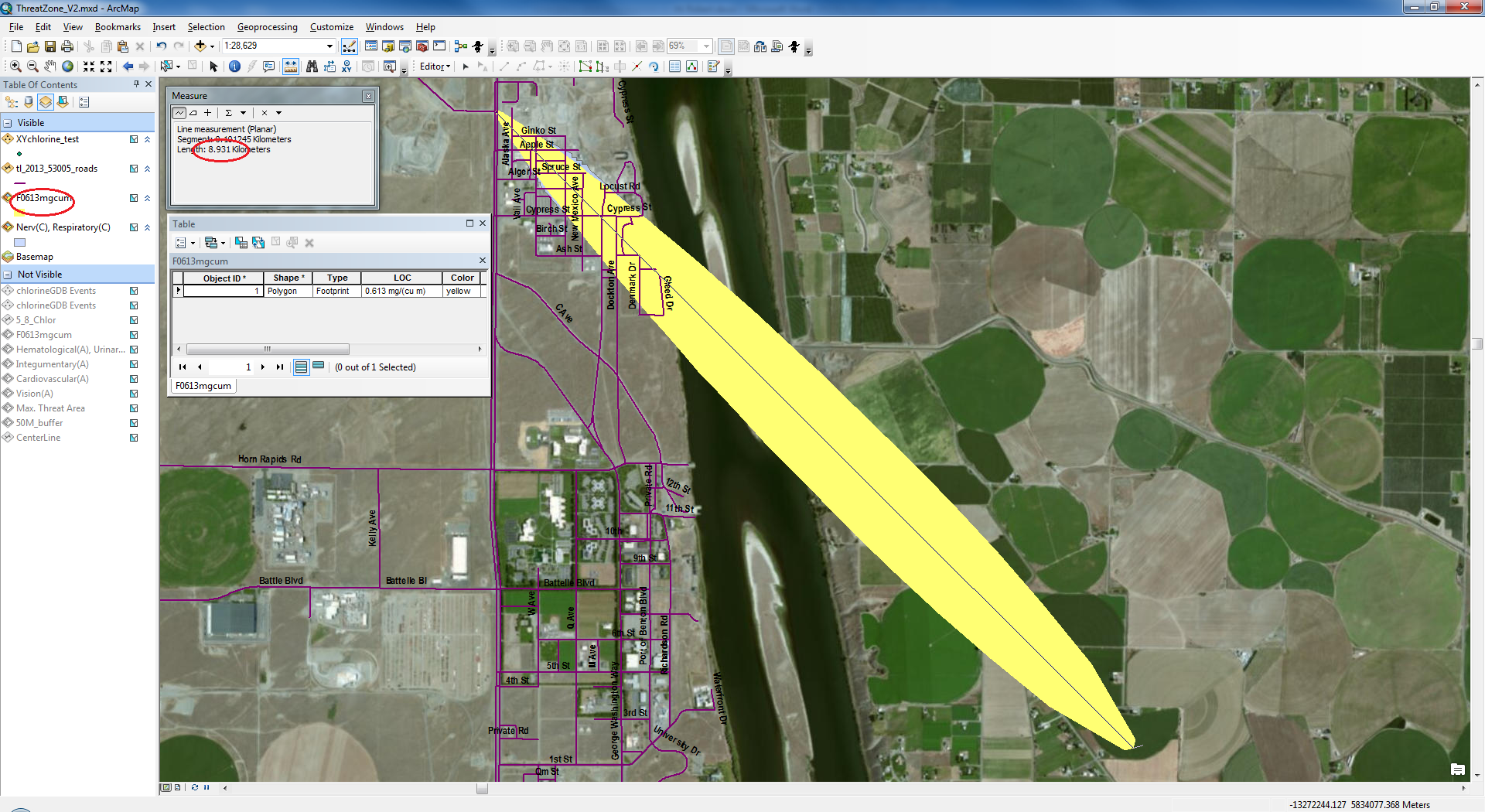
Figure 2. Threat zone displayed in ArcMap
I tried to test if the import tool work correctly or not, so I imported the xy coordinate table of the same plume to ArcMap from excel. It showed the same centerline length as it was in ALOHA (Figure 3) even without projection.
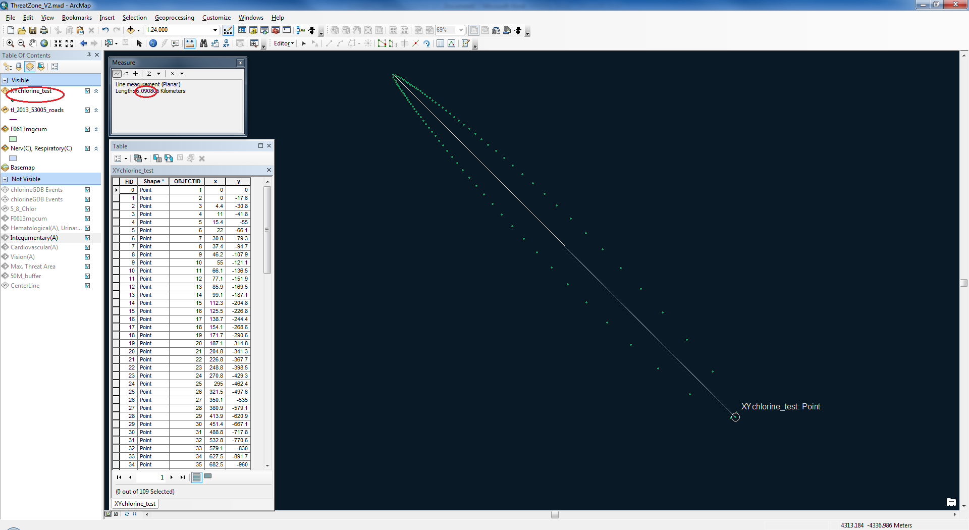
Figure 3. Plume displayed based on xy coordinates
I am wondering if there is anything wrong with this import tool, or because I made any incorrect operation.
Your help and suggestion would be much appreciated.
Best,
Juan (pronunciation similar to Gen)