- Home
- :
- All Communities
- :
- Products
- :
- ArcGIS StoryMaps
- :
- Classic Esri Story Maps Questions
- :
- Re: Embedded story map doesn't render correctly wi...
- Subscribe to RSS Feed
- Mark Topic as New
- Mark Topic as Read
- Float this Topic for Current User
- Bookmark
- Subscribe
- Mute
- Printer Friendly Page
Embedded story map doesn't render correctly with Safari on iPhone 7
- Mark as New
- Bookmark
- Subscribe
- Mute
- Subscribe to RSS Feed
- Permalink
- Report Inappropriate Content
Hello. I just got a new iPhone 7 and in Safari (version 602.1?) the mobile view of my Story Map Journal App goes a little crazy. I am hoping someone else has experienced this or can help me solve it. The app works great in older versions of Safari (on my previous phone), and Google Chrome on the old and new phone. But obviously my concern is that more and more people are going to be getting new iPhones, and upgrading their Safari browsers, and they’re going to have a strange user experience with this map.
You can view it here: http://aeped.com/what-we-do/certified-sites/
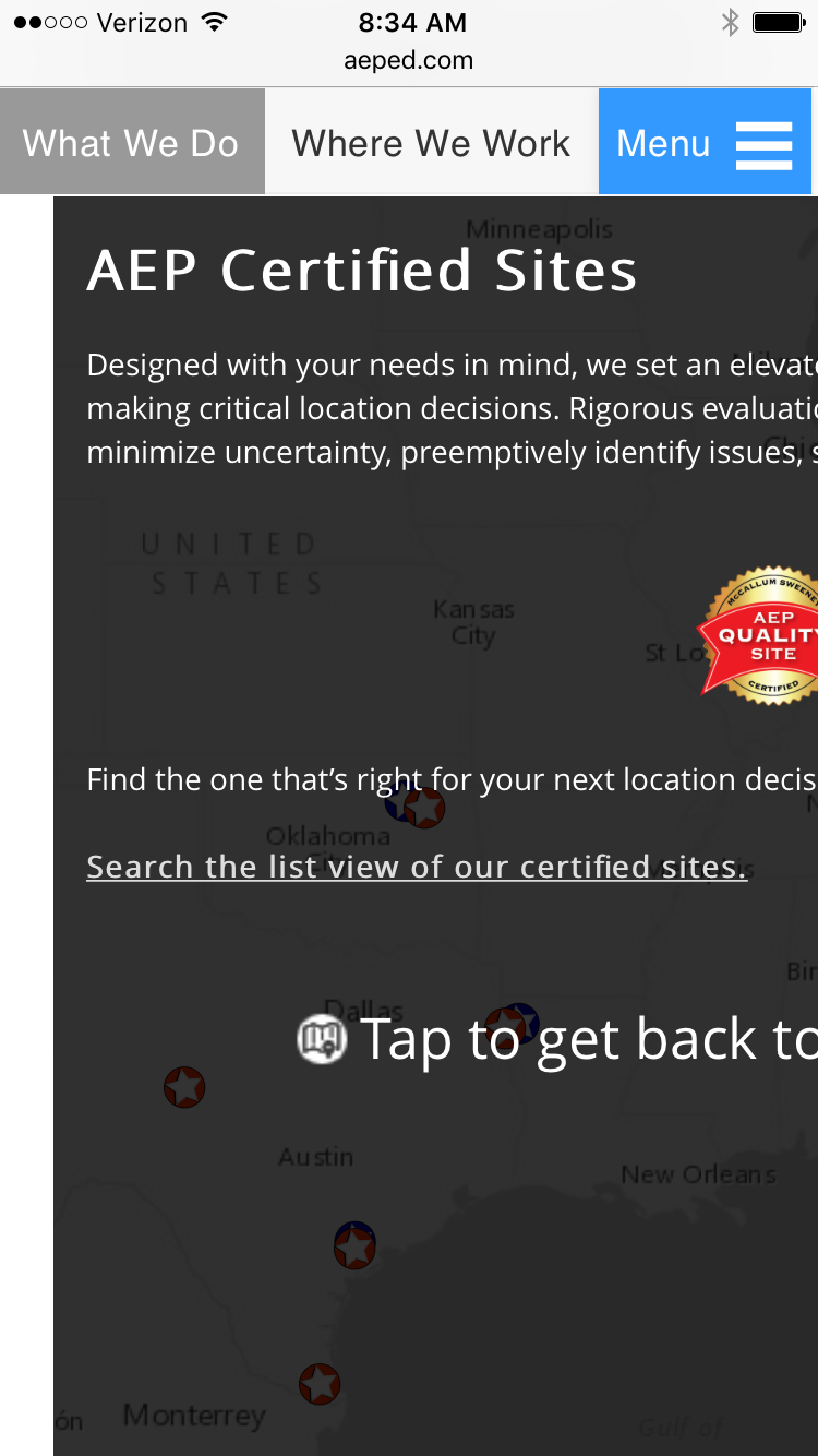
Here’s a screenshot (see OnLoad.PNG) of what it looks like when it loads in Safari on my iPhone 7. Notice the black band at the bottom bleeds outside the container and inappropriately displays part of the next panel’s title.
When I tap for details, the entire details panel stretches outside the screen (see DetailsOnSafari.PNG). When I return to the map, it is also stretched out off the screen and never returns to normal until I refresh.
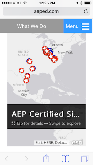
The third image (ChromeBrowser.PNG) is how the exact same page looks like on the same phone using Chrome (and the same way it appears on all other phones I’ve used including earlier versions of Safari). This is the way I would expect it to appear everywhere.
Any information would be helpful, even if you just happen to have an iPhone 7 and want to open this story map with Safari and see if you get the same result.
Thanks!
Robb
- Mark as New
- Bookmark
- Subscribe
- Mute
- Subscribe to RSS Feed
- Permalink
- Report Inappropriate Content
Hi Robb,
Sorry you are having an issue embedding your story map. I tested on an iPhone 6S that's running the same version of Safari you are but I don't see the issue.

Regardless of any device-related issues, it is probably best to have the mobile view of your website simply show a button (or screenshot of your story) that is a link that opens the story in a new tab rather than the live story that is further space constrained by being embedded. That way if someone accesses your web page on their mobile device they don't see the embedded story, they just see your mobile web page with a easy link to open the story in a new tab.
Also, if you do keep the live embed for your mobile view I would recommend making it shorter as it's currently taller than the screen so that also creates an awkward scrolling experience for viewers.
Owen
Lead Product Engineer | StoryMaps
- Mark as New
- Bookmark
- Subscribe
- Mute
- Subscribe to RSS Feed
- Permalink
- Report Inappropriate Content
Hi Owen,
Thanks a lot for your quick reply and your feedback. I am actually glad to hear that this appears isolated to iPhone 7 (or maybe it's just isolated to me - even better). I like your idea of having a mobile view that just shows a button or screen shot to force the visitor into the new tab. That would solve some current and probably future issues (particularly with figuring out the correct height for the app). I will have to discuss with our vendor if that's a possibility. Right now it's just all responsive, based in Wordpress, and there are no special mobile views.
Regarding the height of the map, I agree on that as well, and I plan to shorten it a little more. I think the issue is really caused by the sticky menu we have at the top of the page that never disappears.
I'm definitely still interested to hear from someone running Safari on an iPhone 7.
Thanks!
Robb